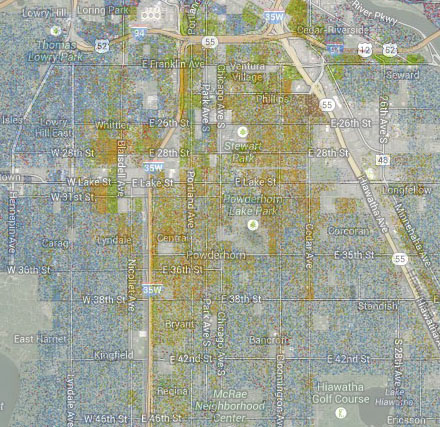
There are some interesting features in the Cooper Center’s 2010 census demographic map in my neighborhood. Overlaying the basic street map on the demographic map, and setting the street map opacity to fairly low, lets us see the demographic dots and still see the feature names accurately (in some areas, I wasn’t sure I was reading the dot map right; doing this imposition lets me be more confident).

Note that Nicollet Ave. is still something of a demographic barrier, and 35W even more so.
But even more, look up at that narrow green area just west of Blaisdell Ave. a few blocks each way from Lake St. And then the fairly intensely yellow (hispanic) area just west of it. Those have sharper boundaries and higher intensities than I would have expected (I believe the green area there is mostly recent African immigrants; I think that’s centered around the place I think of as the African Mall on Grand Ave.).
There are also some very strange things out in the suburbs—sharply bounded areas of a few blocks that are intensely Asian (red), for example.
It’s amazingly easy to match up the lakes, parks, and freeways — nobody lives there, so they stand out on both the demographic map and the regular map.