Particularly since the model name I’m giving you is exactly what the current version of your PowerChute Personal Edition software reports that I am using.
Tag: web
Web WTF?
Oops!
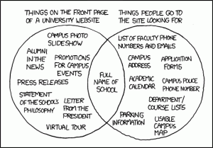
Art vs. Reality (XKCD on University web sites)
Today’s XKCD cartoon seems to have hit pretty accurately. (If you’re not familiar with XKCD, it’s brilliant surprisingly often and very good most of the rest of the time.)

Mark Gritter had the idea of analyzing his school’s homepage.
So I’m going to analyze Carleton’s.

Present:
- Campus photo slideshow — right there on homepage, with popup labels; also “campus photos” link
- Alumni in the news — not linked from front page (they’re in “Carleton in the Media” which is linked from “Carleton News”)
- Promotions for campus events — Calendar on the front page
- Press releases — “News and Stories from Carleton” on the front page
- Statement of the school’s philosophy — no direct link
- Letter from the president — no direct link
- Virtual tour — no direct link
- Full name of school — yep
I score that 4/8 (I’m not scoring #2).
Things people look for:
- List of faculty phone numbers and emails — “Faculty and Staff” link then “Campus Directory”.
- Campus address — “Mailing address” link
- Applications forms — “Prospective student” / “Apply”
- Academic calendar — “Academics” / “Academic calendar”
- Campus police phone number — no (search reveals that the campus security emergency number is 4444)
- Department/course lists — “Academics” gives list of departments, clicking through gets a department homepage with “courses” link
- Parking information — no
- Usable campus map — “Maps and directions” link, then “Interactive campus map”; it’s Google-powered, and names the buildings, and looks accurate
- Full name of school — yep
I score 7/9 (I’m counting things that are indirect links but the chain is “obvious”; obviously this is subjective).
So, not nearly as bad as one might expect; Carleton actually has a higher proportion of the things people look for than they do of the things XKCD lists as always present.
The emergency number is something I never would have thought of, and is probably a good idea. The page does give the main switchboard number. When I was there that was staffed 24 hours a day, but I don’t think it is any more. And it needs to give the external number for emergencies, since people finding that from the web site will mostly be calling from their cell phones. Carleton would never call it the “campus police”, of course.
I’m tempted to snottily say that there’s no parking information because Carleton doesn’t allow parking—but in fact they’ve built a lot of parking lots since I was there, though still not nearly enough for student cars to be common. It’s not in a crowded metro area, and most of the time you can just park on the street fairly close, and the rest of the time you have to park on the street further away; but it should explain that somewhere, and I didn’t find it, even in the “travel by car” section of the campus visits page.
This iteration of the Carleton site is actually pretty decent.
Bad Website Practice
I’m encountering more and more sites that pull their content from a collection of servers sites with URLs in entirely different domains. I don’t mean just linking, and I don’t mean just ads being pulled in; I mean main pieces of page content on “cnn.com” coming from “turner.com” and such.
This of course triggers warnings in any sane modern browser, and in fact they’re blocked by default for anybody running no-script (which you should be).
Web designers–don’t do this! It’s a danger sign, and it needs to continue to be a danger sign. Right now I’m skipping some of your content, and more nd more people are using this sort of protection software in their browsers.


