Somewhat Snarky Observations About Post-Processing

Now and then I see people claiming it as a virtue that they don’t “do anything” to their photos after they come out of the camera.

Like most religious wars, neither side is totally lacking in value.

Ansel Adams said “Yes, in the sense that the negative is like the composer’s score. Then, using that musical analogy, the print is the performance.” (Sheff, David (1 May 1983), Playboy Interview: Ansel Adams, p. 226) With film, the negative doesn’t look anything like the final image (true enough in black and white, far more true in color), and everybody understood there were decisions required to get from there to a print. Everybody knew it was very important who did your printing (and many people did their own printing in the darkroom, at least until they got successful enough to hire a first-rate printer to work for them).

The actual data recorded by a digital sensor is even less like an image that could mean anything to a human—the Bayer filter array records each pixel in one color, and those are then combined with complicated algorithms to make a color image of the result. But software to do that is built into our cameras, so it’s possible for people who are ignorant of that (or just haven’t thought about it much) to have the idea that the JPEG that comes out of their camera is what the sensor actually captured and any change from that is a distortion.

Okay, it’s time to strip off a couple of important but unusual branches of photography explicitly. In scientific, forensic, and probably some other specialized branches of photography one is basically recording data rather than making images. The photographer needs to be prepared to argue (or formally testify) that the image accurately represents reality in the specific ways that matter (and may wildly distort other aspects of the imaging if necessary to make the thing they’re illustrating more clearly visible in the images). These are extremely valuable, important, areas of photography, but they don’t participate in stupid arguments about “altering” photos; they have clear formal standards and principles, and they’ve had them for many decades.  This argument isn’t relevant to them.

The experience of actually being in a place, seeing it with your own eyes, is complex and largely synthetic (built up in your brain).  We see full resolution with only a small portion of the retina, but the way the eyes move around and the brain treats the results makes us feel like we perceive precisely everywhere.  Our eyes can see detail in a vastly greater brightness range than cameras can, and that also enters into our perception.  It’s usually desirable to print camera images so they resemble what we think we see, rather than what we actually see at any one point in the scene.

One of the most obvious areas is white balance. Leaving the camera on “auto” white balance somewhat masks the issue (letting the camera make what is essentially a post-processing decision in digital), but it’s quite common to want to make the color captured outdoors in open shade look much more like the color captured indoors under incandescent light than it actually is. This can be done more accurately in post-processing generally than by relying on “auto”.

Every single scene you stand in front of doesn’t look best cropped to 4:3 (or 3:2 or 6:7 or 16:9 or 8:10). Making a fetish of “not cropping” (by which people mean cropping only in the camera and hence always using that exact aspect ratio) will make your work less good. (With miniature cameras, especially 35mm and smaller, and early digital captures, cropping too much could highlight technical issues (grain, etc.), and it was good practice to try to frame tightly to minimize cropping later, yes. But that’s “try” and “minimize”, not make a fetish of completely avoiding.) Mind you, the look of prints with a natural black border from an oversize negative carrier really is rather nice.

When photographing a static scene with a long span in time, it’s useful to make precisely-exposed images that capture the scene as well as possible. This saves some time later, and results in better technical quality (often just very slightly better, but sometimes vastly better). And old slide photographers who projected their original slides (that is, amateurs) were very aware that there was no option for them to adjust exposure later, or cropping either.  However, those of us who photograph dynamic scenes, perhaps with changing lighting as well, and us moving through them constantly would frequently miss our best shots if we took the time to get perfect exposures each time. Yes, as we get better we judge the exposure better by eye, and just work faster, and that has technical benefits to the work that are not to be despised; but the ability to shoot quickly is very often the difference between a brilliant picture and a useless picture in dynamic situations, and using post-processing to make that brilliant but technically somewhat under-exposed picture look excellent is IMHO entirely appropriate.

Making exhibition-grade images often involves a lot of local brightness adjustment–”dodging” and “burning”, deliberate “vignetting” (or correcting corner falloff in your lenses; the opposite of vignetting), gradient filters (and people used split neutral density filters on their lenses when taking film photographs sometimes, especially slides, because of the narrow brightness range they could capture), and so forth. Darkening areas to suppress distracting detail, creating brightness patterns to lead the eye, emphasizing the important features.  Pablo Inirio was the master printer of Magnum Photos for decades, and Magnum has released a few of his annotated workprints for printing important photos.

Zoom Lenses — do you use the full range?

I’ve heard it asserted that many photographers use only the extreme focal lengths of their zoom lenses.

I haven’t thought this was true of me, and today I had Lightroom plow through the numbers for a wedding a shot last Saturday (plus the rehearsal Friday); and it isn’t true of me.

Focal lengths used with 12-40/2.8
Focal lengths used with 40-150/2.8

I do however use them at their long end more than elsewhere; no surprise there, I’ve always been a telephoto guy.——

Annoying Aspects of Modernity

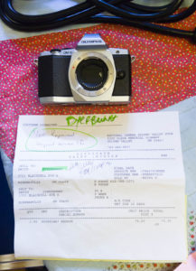
My primary camera came back as “beyond service life” and hence unrepairable.  Even the guy at the camera store was surprised, he had to look up when it was released (it was announced in February of 2012).

Olympus OM-D EM-5 “beyond service life”

Meanwhile, I could easily get a Leica M3 (made around the same time I as) or a Nikon F (about 5 years newer than the Leica) repaired. Of course those two are special cases, they’re both regarded as important classics. And, being old-school completely mechanical cameras, the parts they need can be manufactured pretty easily today, without any help from the original manufacturers.

This was my only video camera and my primary still camera (though the D700 still does a much better job on roller derby and in dark bars and music circles).

I’ve been playing around in my head with where to take the camera collection from here, given that both sides (this Micro Four Thirds body and the lenses for it, and my Nikon D700 and those lenses) are getting old by modern standards (the D700 is even older, having been released in July of 2008; I’ve already had one autofocus system repair). This is rather financially constrained, among other things.  (Some of the Nikon lenses I’m using I bought in 1981, and they still work fine, and still could be repaired though perhaps not by Nikon themselves.)

I think it’s time to abandon flappy mirrors; they’re a silly idea in digital cameras. However, full-frame sensors do seriously better in low light than smaller ones (no smaller sensor has yet matched the specs of my 2008 D700 full-frame sensor), and DSLRs have better auto-focus for tracking and fast action than any mirrorless (except possibly maybe the hugely expensive top-of-the-line Sony A9, which doesn’t take any of my lenses). And there aren’t many full-frame mirrorless lines; there’s the Sony, and a Leica (which makes the Sony look cheap).  But the state of the art in sensors and electronics is advancing constantly; while no smaller sensor has caught up to my D700 yet, they’re close, and no doubt will catch up soon. Of course today’s full-frame sensors are five generations (or some such) better, and still well ahead, but at some point something becomes “good enough” and it’s not worth paying hugely for small improvements for most kinds of photography. Nikon is allegedly about to release their own mirrorless full-frame system, but how well it will work with old Nikon lenses is anybodies guess. For that matter how well it will work at all is still up in the air.

With financial constraints, concentrating back into one system is nearly certainly the way to go, and for cost and flexibility the Micro Four Thirds seems to be the best choice starting from where I am.

Have to think about it; I wonder what I’ll actually do—and when?

Choosing Photos

I’ve spent a lot of my life picking photos—the ones to keep, the ones to print, the ones to give a client, the ones to put online, the ones to show friends. All sorts of different constraints and considerations apply. (To confuse things, this process is sometimes called “editing”; traditionally a photo editor at a newspaper, or highschool yearbook, is responsible for selecting the photos to publish.)

I found some years ago that housemates looking over my shoulder often want me to display a larger percentage of the photos I shot than I generally do. I, on the other hand, think I ought to be considerably more selective than I am for the snapshot album exhibits.

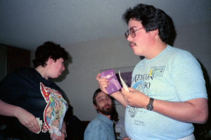
So, here are some examples and thoughts on the question, based on part of one roll I scanned this last week. The photos are from Keycon 7 (1990), in Winnipeg.

I’m discussing these as snapshots (pictures of people you know) or photojournalism (snapshots of people you follow at a distance), not as art!

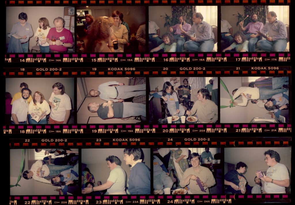
I’m going to show you the contact sheet, and then the ones I scanned, and for a few of those explain why they don’t show in the final collection, or why they do. (The scan decision was made with this article in mind; I scanned some just so I could exhibit them in this article.)

(A “contact sheet” used to be made by putting the negatives on a sheet of photo paper in the darkroom, putting a sheet of glass over them, exposing for a measured time using the enlarger or some controllable light source, and then developing the sheet of paper. This gave you a nice index of all the negatives on that roll on one sheet, all at the same exposure so you could predict exposures for later pictures once you’d made a good print of an earlier picture. This so-called contact sheet is a scan of the negatives in their Print File archival storage page on a flatbed scanner with transparency capability.)

What’s on this roll

We’ll just go through them in order. I’ll be identifying them by the negative number, which you can see below the photo in the edge printing (also above, except on the first row where it was cropped off).

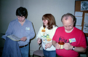
#14

This one is mediocre, but I ended up including it. Nobody shows their face that well (the two at the edges are both looking quite a bit down, and Geri in the center is looking sideways. Also Peter on the right isn’t at all interacting with the other two. Still, they’re all in focus and decently exposed.

#15

Didn’t scan this at all. Ruth is half behind the head of hair in the foreground. There really doesn’t seem to be much point to this photo as it turned out. Probably I didn’t see the foreground person coming.

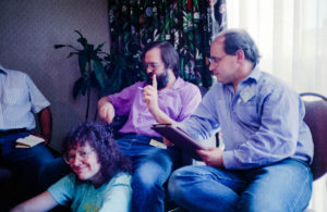
#16

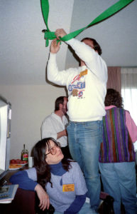
This is a bit sketchy technically; underexposed, and I haven’t manage a great job on color correction. However, the two people in back are clearly interacting, plus what makes it, the person sitting on the floor smiling up at the camera.  This ends up being a semi-decent picture.

#17

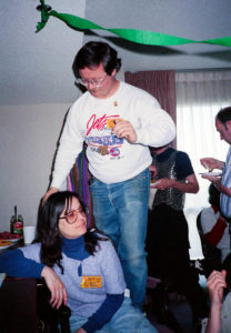
Alternate version of 16; the lighted wand in the back is interesting but doesn’t really communicate anything. However, the great expression in the front is missing, so this was not the one I chose.

#18

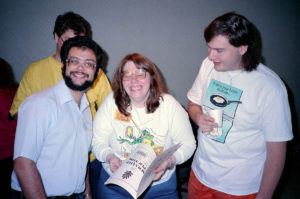
The flaw here is the person in yellow in the background. They’re too hidden to contribute anything, but the bright yellow and enough face to get your attention are still there. However, the three in front are great; Geri’s eyes are closed, but she’s so clearly laughing hard that’s okay, and the two flanking her are clearly engaged. This is pretty decent.

#19

Wanted a photo of Dave Clement, and this one is decent, but Nate’s eyes are closed, so the photo as a whole doesn’t do much good. If photos of Dave were seriously rare I’d just crop this down or something, but while I don’t seem to have another on this roll, I’ve got hundreds through the collection as a whole; not rare. I scanned this so you could see for sure Nate’s eyes are closed, I could tell from the contact sheet.

#20

Best one so far, I think. Fairly nice of both Kara and Ruth, and they’re clearly having an interesting conversation as well as eating dinner. Distracting background, but the flash exposure has brought the foreground up enough that the background is rather suppressed, and that’s generally unavoidable in snapshots anyway.

#21

This could have been interesting, but my timing was off, so the guy on the chair completely disappears behind his arm.

#22

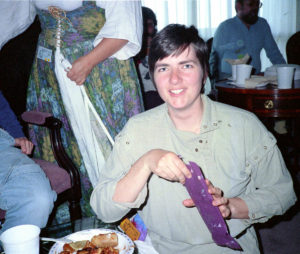
Missed this one first time through, but it’s actually quite nice, and shows us who the person on the chair in the previous shot was.

#23

No scan, no hope. Victor’s hand blocking Beth’s face, Polly a bit out of focus.  Again, if Victor was a terribly rare find I’d use this in some way, but he isn’t.

#24

Ruth getting something out of a bag. Fairly nice.

#25

Mostly bad. Victor could probably be extracted if pictures of Victor were rare, but we just dealt with that above. Beth is interacting with the person behind Victor’s hand, and that person is, um, not looking their best in this shot. No point in this one.

Whinging About Dirty Negatives

Every time I scan a few rolls of my old photos, I’m reminded what the most important message I could send myself back in time is: Get a water filter!

At least, I think that might be what the underlying problem is. I have vaguely similar amounts of junk on films I developed in my home darkroom, in the Photo Coop darkroom at Carleton, and in the Alumni Office darkroom there. I’m not really sure, though.

Here’s a bit from a 1973 roll of Plus-X:

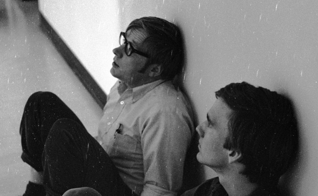
Lots of white mess!  Much of it elongated, but not precisely parallel to the edges of the film. The full-size image is my full scan resolution for that bit of the film.

So, what’s my real problem?

  • Too much Photo-Flo?
  • Not enough Photo-Flo?
  • Wiping film with fingers instead of sponge?
  • Dirty water?
  • Storage since then?
  • Angered the gods?

It’s basically simple in Photoshop to use the healing brush to eliminate most of this. It’s not fast and it’s not very interesting, but it’s simple.   I mean, I can easily spend 45 minutes cleaning up one shot in this sort of condition.  And unfortunately it’s slower and less simple, and less good, in Lightroom.