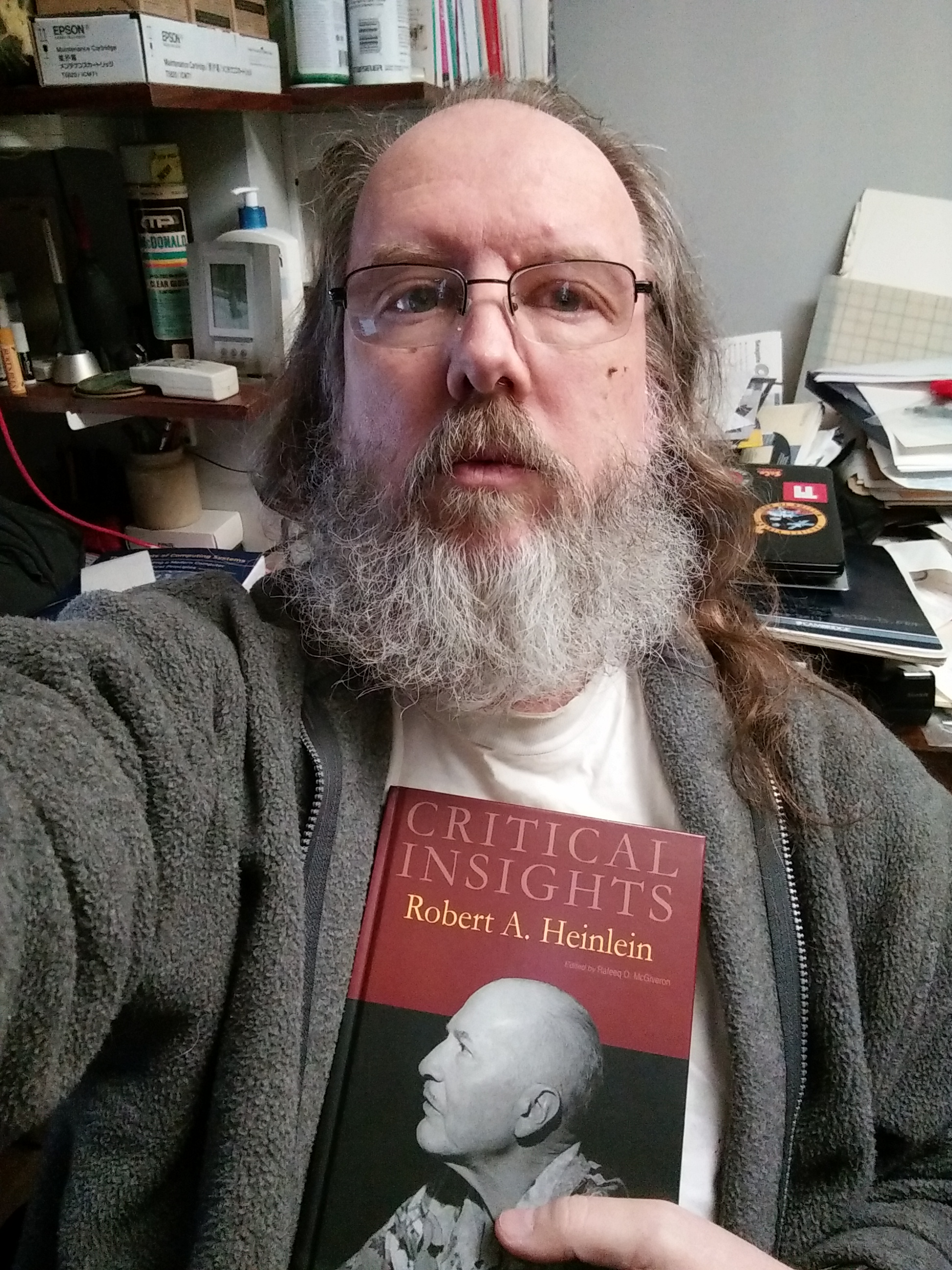
So this arrived today. Actually published towards the end of last year.
I had nothing to do with the text—but they asked me to use my photo on the cover, and I agreed, so that is my photo (from Midamericon, the 1976 Worldcon in Kansas City).
So this arrived today. Actually published towards the end of last year.
I had nothing to do with the text—but they asked me to use my photo on the cover, and I agreed, so that is my photo (from Midamericon, the 1976 Worldcon in Kansas City).
Bokeh is the Japanese word for “blur”, as I understand it. It’s used by photographers to describe the way the out-of-focus parts of an image appear. Some photographers care very much how the out-of-focus parts of their images appear. (Mike Johnston, who now runs The Online Photographer, had a lot to do with popularizing the usage with English-speaking photographers.)
This appearance is determined by the distance the lens is focused at, the distance of the object that’s out of focus, the actual appearance of the object, and the design of the lens.  The example that was widely known among photographers was the “doughnut-shaped” highlights produced by mirror lenses (like the famous Spiratone 500mm / f8). These are caused by the secondary mirror, which is mounted at the front of the lens and blocks some of the light coming in.
This article, among others, pointed out that one could use a mask in front of the lens to control the shape of these out-of-focus highlights. I decided this was possibly interesting, worth playing with.
Other people seem to use this thin, opaque, black paper that I’ve never seen in the real world (probably the right art supply store would have it). I tried using card stock, and card stock with black tape on the back (to make it more opaque), and I also tried photo paper printed with black ink (by printing the mask surround in black, leaving the mast white, I made a good guide for cutting out the mask). Except for the taped card stock, none of these were all that opaque, but they might well be opaque enough.


I imagine that, with practice, I would get better at the part where I actually have to cut out the shape in the mask. At least, other people have! (I’m not especially prone to cutting my own fingers, anyway; so it’s not dangerous, merely somewhat annoying.)
I’m making these as 67mm squares, so that they’ll fit into a Cokin series A filter holder. I feel like this is kind of clever, really; it’s much easier than making my own slip fitting to hold the mask to the lens, the way the first article I linked does it.
The size of the cutout matters. My first try, which is what’s illustrated here, were too big. I did another set less than half the size that worked better. My current rule of thumb is that it seems to work okay when the cutout is vaguely half the diameter of the front lens element, but I haven’t experimented enough to know how this will hold up. When the cutout is too big, the shaped highlights off-axis are incomplete.


For my abilities at drawing and cutting, preparing the masks in Photoshop and then printing them onto the final paper before trying to cut them is a good approach. It limits my chances to mess it up, and makes it easy to produce another one if necessary, and to produce them consistently to standard sizes.
My next step, when I think I’ve worked out what mask size I really want, and how to set up a set that displays the bokeh usefully, will be to try printing masks directly to inkjet transparency material. That eliminates the cutting entirely−and makes possible the use of designs too complicated or too fine for me (or even other people) to cut out. We shall see!
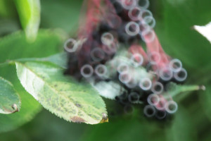
The illustrations above are from about my third attempt; by then I’d constructed a cardboard sheet with holes carefully made in it and a well-lit white panel behind it, so the holes showed bright.  In the small example shown, the camera was maybe a foot from the key, and the sheet with the holes was about 18 inches behind the key.  The lens was an Olympus 60mm f2.8 macro on an Olympus OM-D EM-5. A wider aperture would have worked better, but working at this small size required the close focus of the macro lens.
It takes a fairly carefully set up shot to really exploit this effect. You need highlights that are sufficiently distinct from other detail to show as unique objects, and you need them sufficiently out of focus to render them as nice simple disks (or hexagons; depends on your lens) without a mask. (I’m not going to write an essay on focus and depth of field; if you don’t already know, look it up elsewhere).
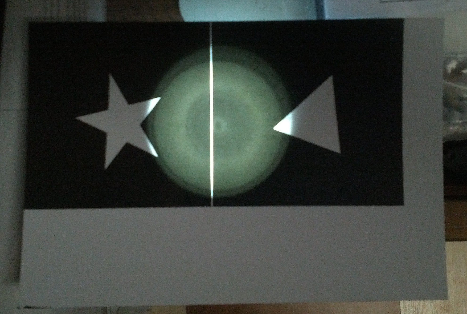
Here is a pair of photos, without and with a mask, showing that if the highlights aren’t making clear obvious circles without a mask, when you add a mask, you won’t see its shape in the resulting image. (The mask also darkens the overall image; not surprising since it’s blocking a lot of light from entering the lens.)


So I set up a larger and more drastic set to demonstrate bokeh control. In the end it looked like this (the hat on a light stand gives a rough idea of how big a human head would be at that distance).

This was rather nice; though I would have wanted to light the human subject more if I’d had one!


I’ve spent a lot of three days playing with this, ordered additional adapters from an Ebay seller and from B&H, borrowed LED Christmas lights from Corwin, and made a lot of improvised background and support gear. But at least I’ve got some tolerable initial results.

My best test results above could probably be reproduced fairly easily in Photoshop. Exactly would be hard, but I wonder how many people would notice the difference. (The dimmer set of highlights, which are reflections from a glass door behind the lights, for example, might not occur to somebody simulating the effect.)
In video, however, camera movement should make things a lot more exotic, since the details of each image will change based on the angle various key light rays enter the lens.
Finding or creating setups where this can be exploited is clearly non-trivial. I’ve got some band shoots coming up, though, where reflective objects abound, many light sources are in use, and adding something as drastic as Christmas lights wouldn’t be entirely out of place if necessary. Now, imagine masking that with some band-related graphics, a shape or even perhaps something too complex to cut printed onto overhead transparency sheets. Maybe?

I was going through a sample pack of paper, printing the same test pictures over and over (being very careful to use the right profile and driver settings for each particular sample sheet of paper). When I got something like this.

It wasn’t instantly obvious to me what the problem was. I tried another paper. I tried a nozzle check.

That wasn’t obviously bad. The black printing was weirdly faint, but this was maybe the second time ever I’d done a nozzle check on this printer and I didn’t remember the last one that well. (Of course, they look nearly identical to all the other Epson printers, so arguably I should have caught on sooner).
So I resorted to calling service. They said do a head cleaning anyway, so I did a head cleaning.
And got this nozzle check.
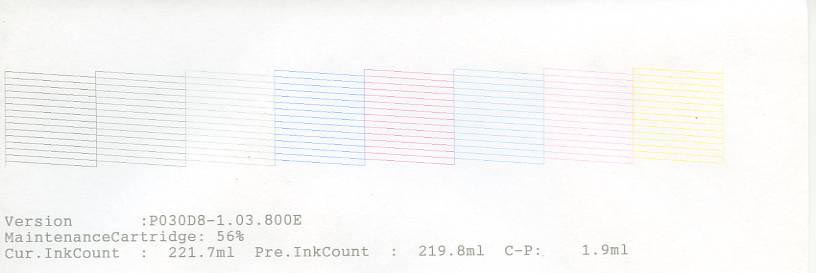
Well whaddya know! I’ve never had an entire color go out 100% suddenly like that.  And the arrangement of check squares was a better layout with the dark black missing.
The actual test print looks much better too.

So the new Epson 3880 is still my friend.

People following my blog can probably guess why I’m concerned with this just at the moment.
The formal purpose of the artist’s signature is to certify that particular print as meeting their artistic and technical standards.
My research strongly suggests that there is no consensus on what is expected by art buyers, collectors, or museum curators. They do all seem to like consistency, so you should decide early on what you’re going to do, and do that from then on. Or at least make rare changes, and make the changes cleanly and ideally document somewhere people can find that you have done so.
So far as I can tell, people do anything from nothing at all to using a stamp or “chop” on the back to signing the front (“recto”) or back (“verso”). They write anything from their initials to a regular signature, or print their name, or anything else. They often include a date or two (for photography, date of image and date of print are the two most often used). They sometimes include the title of the print. They use anything from metallic-ink sharpies to pencils. They write on the back, or in the margin on the front, or within the actual image.
The full form I like is to put the image title and year photographed in the bottom margin at the left, and the signature and year printed at the right. I will leave enough space so it can be either included in the mat opening, or matted out, at the owner’s choice.
However, when signing a batch of prints all at once, that’s too much to write (it is; I’m not lazy, I just have lousy handwriting, and if I tried to do that much on each of a pile of prints, it’d end up illegible on most of them). If I were clever and thought ahead more, I might print the image title and year photographed as part of the image (an image of my careful printing; I can do it once legibly if I get enough chances), and only do the actual signature and year printed by hand.
Specifically, with what? What writing instrument?
The requirements as I see them are:
Those first two are sometimes lumped into “archival”. Given the complexity of the inkset-plus-paper chemistry encountered in modern digital inkjet prints, adding a third thing, the ink from the signing pen, to the equation is at best a wild gamble. Ink plus paper combinations get tested by various firms, but I’ve never heard of any of them adding signing pens into the mix.
Given this total lack of real information, I’m making a wild leap of faith: I’m accepting all writing implements that make claims of being permanent and (critically) neutral Ph (or acid-free). And I’m taking their word for it; I have no way to verify it much. Amateur testing is interesting as far as it goes, but accelerated testing is a black art, amateurs aren’t very good at it. And for art prints, I’m thinking in terms of the print lasting for centuries, not just years.
The totally conservative approach is to stick to pencil (graphite, not very reactive) or India ink (basically a carbon suspension in water, not very reactive). I find that too limiting, especially since pencil doesn’t write on the front of this paper.
I tried a bunch of pens I liked writing with and had sitting around on this paper. Surprisingly, everything with any sort of “ink” wrote beautifully on the particular paper I’m working with this time (Canson Baryta Photographique). One dry pencil also worked fine (the Schwan all-stabilo 8046); a mechanical pencil with HB lead and a charcoal marker didn’t mark at all. (Maybe it’s not that surprising; this paper has an ink-receptive surface layer after all.)
Even more surprisingly, every pen I looked up info on claimed to be archival and acid free; apparently all of these pens I grabbed meet my technical criteria. (Well, all but one; for total giggles I tried a Big Round Stic, a very cheap ballpoint. Surprisingly, it wrote on the paper perfectly well. It’s hard enough to damage the surface, and I have no reason to consider its ink suitably permanent, so I would strongly recommend against actually using it to sign artwork.)

The implements I tried include:
Here are the various results. I’m not bothering to label individual trials, you’ll need to try your pens on your paper anyway, but this shows that a wide range of pens made good solid clean marks on this paper, at least.

I also tried a few of them on the back of the paper.

ADDED: I found the Sakura almost impossible to smear. The other roller pens could be smeared just slightly by running a finger over them immediately after writing—not something I do frequently by accident, but it also indicates that stacking prints as I sign them might be a problem. The Stabilo pencil also smeared a tiny bit, interestingly.
How To Sign Photographs part 1 part 2 part 3 part 4
I’ve been meaning to do an article on this for years. This week, this image is on sale through The Online Photographer, so I thought I’d better get around to it, in case I might be able to stir up an additional order or two.
I’m simultaneously rather excited and a bit scared about writing this. I’ve had great hopes for this photo since I shot it in 1975, but never got a satisfactory print until 2007 when I had
Ctein wrote a column about that for TOP back in 2007.
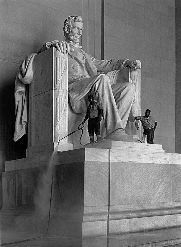
I thought the Lincoln Memorial shot had promise at once; it’s marked on the contact sheet with red grease pencil as I did then for things I wanted to try to print. I remember not being able to print it at various stages and with various technologies; but looking at the contact sheet and early scans now, I think at least the first scan is something I could work with. I suppose it’s possible that I’ve learned something about digital printing in the last two decades. Probably other people could have printed it at earlier stages, too.
Then, on top of that, I really wonder if maybe I should have paid for more bits of drum scan (16 bits or higher res?); maybe it could be even better.
Yeah, I’m all wrapped up in getting ready for the start of the sale, which means I’m questioning every decision that it’s too late to change.
However, what I’m actually going to write about here is printing this picture. I’m working largely from memory (Ctein doesn’t tend to create a layer structure that preserves every single decision made as a separate event), but I do have the contact sheet (and negative), Nikon scan, drum scan, and the 2007 and 2014 versions of the edited file, so I have at least some objective evidence of what was done to aid my memory.
How we accomplished things might be of some interest, but what we chose to accomplish, and why, are far more important. Of course I have even less evidence for those; that’s nearly entirely from my memory.
The problems actually start one step back from where you might think. You see, I have three exposures of the memorial from this trip.

This shows them in backwards order (note the negative numbers at the bottom). So, at the left there is the one I actually printed. In the middle is an even more underexposed version, of no particular interest.
And at the far right is what first caught my eye. It wasn’t just Lincoln and the park workers, it also included the family in the foreground at the left. Unfortunately, it was done in such a hurry that the exposure is awful, and the family is cut off too high (for no good reason, there’s free space at the top), and that guy on the right is a problem, and there’s a guy on the left between us and the family too (I suspect one or two of the spare guys walked into the frame between when I saw the possibility and when I was able to shoot).
So, in the end, there’s no choice, there’s only one version worth working with. You can’t obsess about the ones that got away, because if you shoot people living their lives, a lot of things you see get away over the years.

I started with a scan I made myself (Nikon Coolscan LS-2000).
First, you may notice there’s an amount of crap on the negative. That’s easily fixed, if annoying. Also, it mostly looks pretty good; I think my saved file of this is significantly adjusted, not straight.
Also, that the cropping is somewhat different, and that there’s that ladder in the background, and that the perspective is also somewhat different.
I might have been able to make something of this, eventually, but I didn’t at the time.

So I went ahead and had a drum scan made (some years later).
Even at the small size it looks a bit more flavorful to me (remembering that we’re looking for information to work with in printing here, not finished art!). It’s smoother. Also they either cleaned the neg better than I did, or spotted it a bit.
First time I’d done this, so I probably didn’t give the lab the best instructions, either. What I’ve got is a 40 megabyte tiff file in 8-bit (per channel) RGB, which is a pretty strange choice for the lab to make when scanning a B&W negative.
When Ctein first got his large-format printer, I was out in California about a week every month for work, so I was visiting fairly frequently. He suggested I bring some image files that we could play with printing, so the next time I went out I did. Came back from that with four prints I believe (four that I still have on my walls, at least), and we worked on a couple of others a bit before moving on. We spent about a day and a half doing that and very little else, which was a blast.
(My usual readers mostly know who Ctein is, but for those who don’t: he is or has been a photographer; custom printer in dye transfer, B&W, and digital; author of two books on printing; and writer for many photo magazines.)
In case you’ve never tried it, I can tell you that you can learn quite a lot sitting for hours with a master printer working on getting photos ready to print. We’ve done this off and on at my computer and his over the years, sometimes just poking at ideas, this one time carrying several images all the way through to making actual large prints (24″ paper, the images are about 20″ wide and 30″ or so long).
Okay, so what all did we do, anyway?
I think of this as global contrast adjustments. Treating the picture as a whole, we’re putting the major parts into appropriate tonal relationships.
The Lincoln Memorial is a masterpiece of neo-classical design. I wanted to present it in the print with that kind of formality, both for its own sake, and because that increases the contrast with the workers standing casually on the statue.
In this case, a bit of straightening plus removing the vertical convergence were required. This is an area where digital printing has it all over darkroom printing; you can do a small amount of perspective correction in the darkroom, but most enlargers make it very annoying, and the physics limits pretty strongly how far you can take it.
If you’re doing this kind of work a lot, it can be worthwhile hauling a view camera around, or at least a perspective control lens, which lets you fix the convergence in the camera. On the other hand, that means you can’t get such shots of anything but static scenes (well, or scenes that can be predicted reliably). With digital, you can get the perspective you want in more dynamic situations.
Anything from large-radius unsharp masking (with a radius up in the 50-75 pixel range you’re changing the local contrast quite strikingly) to simple dodging and burning to fancier Photoshop tools to additional curves adjustment layers with individual layer masks. I believe we used some techniques to enhance contrast in both shadows and highlights without making the whole picture look flat
Another place where digital printing has it all over the darkroom! I think Ctein hit this with Neat Image after playing with the settings a lot. Neat Image has a lot of settings, and I use Noise Ninja (which is simpler and quite effective) myself. Ctein uses both (and other newer things), choosing them for how well they work on the particular problems in a particular image.
Much simpler in digital than in the darkroom. I don’t have to manually spot each print with a palette of dyes and very very fine brushes, and yes, I’ve done that. (Yes, it’s so easy one can get lazy about cleaning negatives before scanning, which is not good.)
This level of retouching was done on darkroom prints for advertising photos sometimes (even in color), using air brushes and such, but I would certainly never have tried it. I’m glad to have the ladder gone, though. (I remember removing it was Ctein’s idea. I learned one Photoshop technique I hadn’t known previously watching how he did it, too.)
The one thing that’s close to exactly equally easy in darkroom and digital!
Deciding how to crop is black art, mostly. In this picture it’s fairly simple, we’re trying to retain as much image as possible while eliminating a few distractions. Composition is always important, but this is a photo with a strong subject which draws the eye quite easily on its own, we don’t need to do a lot of work to get you to see the important bits here.
I always did prefer the cold-tone Agfa papers. With Epson Ultrachrome printers, in the B&W mode you can easily adjust the B&W image tone in the printer driver, and we turned it modestly to the cold side. I don’t remember numbers.
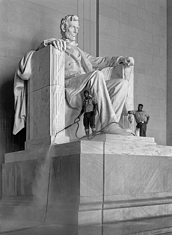 Final Outcome
We re-worked the image when Mike Johnston of The Online Photographer decided (at Ctein’s urging) to offer this as their July print sale (TOP has done a couple of print sales a year for a long time, but is just starting to experiment with having print sale every month).
To really see the final outcome, you need to go over to The Online Photographer and buy a print, but, for purposes of this article, here’s the jpeg we’re using to represent the final print.
Memories of this are more recent, plus the discussion was conducted in email. So I know what we aimed to do better than above, but I’m not nearly as clear on how Ctein achieved the goals since I didn’t see that happen.
So, here are the additional changes we made for the final version.
I think Ctein probably felt, now, that the original print was maybe too dark (though he didn’t have it in front of him when doing the new versions, just the file). But also, for a smaller print, the proper brightness range is different, usually lighter, than for a bigger one, and the print sale prints were going to be smaller than the first print we made in 2007.
Even after lightening, Ctein could get some more there, so he did.
But we got weird illusion halos. But Ctein killed them off.
In the first proofs I saw, I felt that the side and toe of Lincoln’s shoe, the hose near it, and the left worker’s boots ended up looking funny, low-contrast and weird. I suspect it’s actual spray from a few seconds before still in the air, and hence completely “natural”, but it looked weird, and I think what matters in this kind of print is that it look believable, not necessarily that it be slavishly accurate (obviously for forensic or scientific photos, or even just photojournalism, the rules are different!).
After the above, it looked bizarre for other reasons, so Ctein messed about until it didn’t. I didn’t see the intermediate state so I can’t be too specific.
I felt that the big hulking pedestal was drawing too much attention to itself. I didn’t want to crop it out, I wanted Lincoln to be clearly above us and it contributes to that, but I wanted it to draw less attention. Again, we pushed this to the point where some artifacts appeared, which Ctein then had to eliminate.
Didn’t want to darken the spray or make it less visible while darkening the side, so magic was done.
So, to make it easier to compare, here are the initial scan and the final image side by side.
The list of things done looks long, but I don’t consider this to be an example of “extensive” manipulation. We did take one thing out (the ladder), but it was a background element. Other than that, we did things that were basically “optical” in their results, all of which can be done in the darkroom. It’s just that, when you start writing down every little thing, it ends up being a long list.