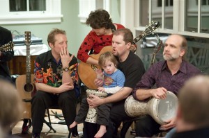
Or “editing”; as in one part of what a “photo editor” did for Life magazine, back when.
There are two basic approaches. Well, there are a bunch of dimensions to sort the approaches into, and one of those dimensions is absolute picture quality vs. illustrating a particular detail of the event.
The best-looking bunch of photos will result from thinking like an artist, and simply never showing anybody photos that aren’t of the best quality.
However, there’s a lot to be said for thinking like a photojournalist, too. People will often want to see photos of each particular detail, especially if they are in them. When you’re shooting basically for family and friends, this may well be the way to go. You still don’t want to present 20 photos of the same situation, though—even your family and friends will run out of patience then.
One could say that this is a problem I create for myself. If I didn’t shoot so many similar photos, I wouldn’t have to sort through them later and pick the best ones. That’s certainly true. However, I also wouldn’t get as many good photos. While it’s very much not the case that taking more photos automatically results in more good ones (a fixed percentage of good photos), it is true that working harder on finding the best way to shoot a scene results in taking more photos of it. And chance does play a role; things happen faster than I can see in the viewfinder, and it benefits me to just keep trying.
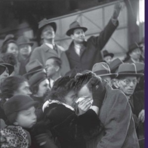
Which brings us, finally, to the beginning of the subject I wanted to address: how do you decide which of those 20 photos of a scene you want to show to people? One thing this comes down to is the eternal question of just what makes one photo better than another. Clearly absolutes aren’t the way to go. Photos that are visibly unsharp have become famous, even iconic (for one example, the cover photo on the Museum of Modern Art’s recent book on Henri Cartier-Bresson, The ModernCentury, isn’t perfectly sharp). Apparently even basic technical flaws can be forgiven, if the photo has enough to offer.
I happen to have 11 very similar photos from one sequence that I shot last night, that I was trying to pick the best of earlier today. They’ve all been given a quick color and density correction. None of them start out cropped (though we’ll be discussing cropping as part of the selection process). And, for today, we’re going to skip the extreme choices (which aren’t allowed in real photojournalism anyway; things like making composite images with the best parts of several photos from the sequence).
So, let’s try and make sense out of which one is the best. I’ll put comments on each below the photos.
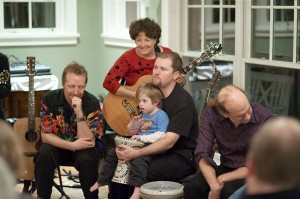
Becca, Dave, and Nico are all focusing the same direction, and Becca has a nice expression. Bruce is looking away, though, and Adam’s head is unfortunately placed. This could be cropped down to a vertical showing only those three, though.

Clearly better than #22. Curt has looked up and so has Bruce, so now all five are focused on something.
Bruce is engaged and playing now, and Nico is looking out at us. But Curt and Becca are clearly involved in something else in the background, which rather diffuses this photo.
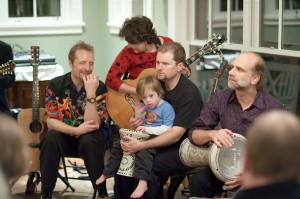
Pretty much the same as #24, though there’s less the appearance of a conversation in the background.
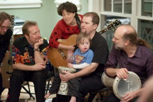
Now everybody is focused in, including Scott who has stuck his head in from the left. Bruce is unsharp, though; so why didn’t I pan left a bit more and get a usable Scott?
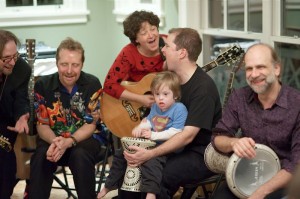
Now we’ve got sub-groups; Becca and David, Scott and Curt. But Becca and David really seem to be into that harmony. Nico is looking out, and so is Bruce (and Bruce is still not quite sharp; he’s enough closer that he’s outside the DOF, which really isn’t very much at f/2 at 85mm).
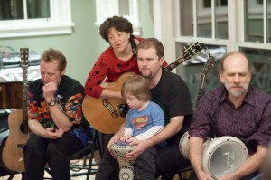
Only Becca is clearly performing, and Nico is attracted to something outside the frame, so this one diffuses away to nothing.
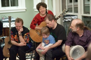
David is focusing on Nico, and Becca is probably watching that, but it doesn’t seem to me to come together as a photo. No eyeballs are visible in the entire frame.
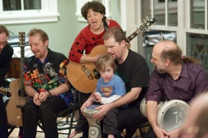
This is pretty good especially if I crop to roughly a square of the right side; Bruce is looking back at what’s going on between the three in the middle.

About the same as #30, but Bruce is looking forward and badly blurred, not a good combination (blur is much more acceptable for the side or back of a head).
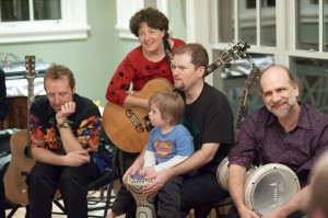
We’ve got nearly everybody (not Curt) clearly focused the same way again, and nice expressions, and some eyeballs. This one would have to be one of the serious contenders (possibly cropped to exclude Curt, or possibly not, depending on the needs of page layout or whatever final use these are for).
After a while, when you’ve looked at too many similar photos, don’t they all start to look awful to you?
So, where is this leaving us? It’s leaving me still considering 23, 27, 30, and 32.
How do we score this game? Flaws, virtues, some way of balancing them, entirely by intuition, what? Generally speaking, flaws are easier to identify and agree on; but in my experience they’re actually less important than virtues. A photo with no flaws and few virtues is mediocre at best, whereas a photo with many virtues and some serious flaws is often (but not always) of interest.
I think I’m going for 27. The big virtue in 27 is the intensity of the look between Becca and David; and in addition to that, it has few flaws. All the performers appear engaged, we see eyeballs pretty much everywhere. Nico is quite focused on his drumming. So everything is going well, and there’s a significant high point to pull the average up.
So, somebody disagree with me!
