Let’s start with “book design”. Book design is something I’m not competent to do, let alone write about.
However, for a piece of prose fiction it’s easy enough to make decisions about margins, fonts, page headers and footers, paragraph styles, and the like that won’t embarrass you too badly and won’t interfere with people trying to read your book; and that’s good enough for the vast majority of cases.
Many people will argue that you don’t actually want people noticing the layout of the text in your book, because that would be interfering with people paying attention to the words. I agree with that, personally—but I also think that really good design can add to the reading experience without being intrusive.
If you want to go to that level, get a good designer. (If you’re a designer yourself, do please ignore everything I say about design. My advice here is intended to help duffers stuck doing their own design to avoid messing it up too badly, and consists almost entirely of broad pronouncements based on basic rules of thumb that aren’t absolute principles of design. If you’re not a duffer, you know all this and much much more, and the most I can hope for is that you’ll nod tolerantly at me rather than becoming enraged.)
I’m also assuming you already know a lot of terminology—what the front matter is, what a title page and copyright page are, what body and display fonts are, what serif and sans-serif fonts are, and so forth.
I’m not making assumptions about the software you’re using, so I’m not giving any detailed instructions on how to achieve any of the things I recommend. You don’t need a fancy page layout program like InDesign; you can implement the sort of simple design I’m recommending perfectly well using the Libre Office, Open Office, or Microsoft Office Write apps.
There aren’t really rules about this. Your goal isn’t to get it “right”, your goal is to make your book easy and pleasant for people to read. For duffers, this means you should not try exotic or unusual things. Stick to the basics, do simple normal things that are known to work fine.
My advice here is primarily for hardcopy books; variations for ebooks will be noted (primarily, margin rules are vastly different, you don’t really have control of the fonts, and page headers and footers aren’t available in ebooks).
Front Matter
The half-title, title, copyright, acknowledgment, and other pages at the beginning of the book tend to be individually designed, not conforming to any standard scheme. The title page, in particular, is often a location in which some showing off of the design will take place.
These pages probably shouldn’t have headers, footers, or page numbers on them. They do need margins, about the same as any other page (see below).
Body
In the kind of book we’re discussing, this consists of the actual content—the novel being published, in the case we’re discussing (with a few minor notes covering collections and anthologies).
Margins
The inner margin needs to be larger than the outer margin, so that the “gutter” where the two pages that face each other in a bound book come together doesn’t swallow the text.
Your printer/POD provider may well give you guidance here (CreateSpace does for example). They specify minimum inner and outer margins. Those are largely technical constraints, and are not big enough for a good reading experience.
Your software will have ways to set different margins for even- and odd-numbered pages, or an even more convenient option to mirror the page layout automatically and let you specify “inner” and “outer” rather than “left” and “right” margins.
For books in the 300-500 page range, CreateSpace gives a minimum of .625 inches inner margin. That’s conservative; I’m using .7, and I feel I’m pushing the limits to keep the page count lower.
Using less than half an inch outer, top, and bottom margin strikes me as overly aggressive as well. The binding and trim process is not absolutely precise, and the reader needs some space to hold in, and the edges of a heavily-read book pick up dirt and become harder to read. (The CreateSpace minimum is .25 inches, which is far too small for flowed text; it’s relevant for illustrations.)
Ebooks basically don’t have margins (or they’re set in the display app).
Headers and Footers
Readers expect and use page numbers, so you should include them. I think the least intrusive place to put them is at the bottom of the page, centered. I usually set them in the same font as the body text, perhaps a size smaller.
Many novels have the author’s name as a running head on one side and the book’s name on the other. When they’re doing this, they often include the page number there too (usually at the outside edge). There’s nothing wrong with this—but I don’t really need to be told the name of the book and the author that I’m reading at the moment; if I need reminding, I can glance at the cover. And getting those added to the page without interfering with the rest of the design is harder than just putting the page number in the footer.
For collections (a book of stories all by one author) and anthologies (a book of stories by many different authors) it makes a lot of sense to put the story title as a running head, though; it helps you find the story in the book. And at least for anthologies, including the author makes a lot of sense as well.
Ebooks generally don’t have headers or footers, including page numbers.
Fonts
Two fonts is plenty for the body of the book; one for chapter titles, and one for the body, page numbers, and running heads. (Pros often use more quite effectively; again, this is basic advice for duffers, trying to avoid screw-ups rather than encourage great design.)
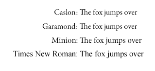
The font for the actual body of the story should be from the “body fonts” part of the (huge) world of fonts. These are normally “serif” fonts (the claims that serif fonts encourage reading flow seem to be in doubt last I checked, but they’re still the traditional choice here). Body text is usually set at around 11-12 points, but it depends a lot on the font. A very few basic choices are Times New Roman, Minion, Caslon, and Garamond (see examples). If you’re not used to looking at fonts, you may not see any difference at all (except in size) between those four! (Minion and times have a higher x height, the ‘j’ and ‘e’ in Times are fairly distinctive, the serif patterns are a bit different, etc. People with decent font knowledge can recognize which of these is on a page with quite brief study.)
The font for chapter titles would normally be a display font (or at least a dual-use font). If you have actual titles, and not just numbers, for your chapters, avoid anything too complex (Magnificat is too complex—by a lot). And they should be several sizes larger, maybe in the 14-20 point range, but this also depends a lot on the font.
Oh, and justify both margins. This is a book, not a term paper.
Fancification
Decorative dingbats, drop caps for the first letter of a chapter, setting the first half line of each chapter with small caps, and so forth, can all be omitted without loss. (Good designers can do nice things with all of these, in ways that can enhance the reading experience, but if you’re a good designer, you don’t need my advice on this.)
Paragraphs
For a novel body there’s really only one right way to paragraph: indent the first line some, around .2 inches maybe. Do not add extra space between paragraphs.
Back up in the front matter, I tend to do the copyright page with non-indented paragraphs with space between them. But not for the body.
Also, turn on widow and orphan control, both set to 2 lines.
Result
So, here’s what a page of my design for the new Blaisdell Press print edition of Pamela’s Juniper, Gentian, and Rosemary looks like:

The body font is Minion, the chapter head is Garamond with small caps.