Jumping back a book, since I don’t have anything really like a cover design for the current book yet.
I’ve never done a book cover before, and again (like the interior design) I’m not competent to do one. I feel like I got lucky this time, and will probably never make another cover this good.
Here’s what I ended up with:

This is a wraparound cover for a trade paperback. The light rectangle on the back near the spine is an approximation of where the ISBN barcode block will be put in by the POD provider. (I have to take that out before actually sending it to the POD provider, but I needed to know roughly where it was to avoid it blocking anything important).
What’s a cover for? Well, depends on how your book is being sold.
I think this one is going to be sold mostly to people who have heard of it, or at least have heard of Pamela, and that a lot of them will be specifically looking for the book after having heard it’s in print again. For those people, the cover is rarely important, and is more likely to be a negative influence than a positive (“I heard this book is good but look at that cover! Ewwww!”). Furthermore, I think the vast majority of sales will be online, and the cover is much less important there than when people have the book in their hands.
On the other hand, major publishers often sell most of the copies of their big sellers through airport news stands, Walmart, and so forth, and mostly to people who had no special intention of buying that book at the time. The requirements for this kind of cover are completely different (and I know even less about them).
The one thing it’s definitely not is an illustration of the story. It’s purpose is to grab attention. The cover is entirely a marketing piece, and it’s bad if it attracts people to the book who won’t like it (because they put out a stream of bad word-of-mouth).
What do covers have to have? Not much, really; it’s not about meeting requirements, but about successful design.
It’s generally thought important, at least by the author, to name the author of the book both on the cover and on the spine. (Okay, seriously, most dedicated readers buy by author a lot, so it is important.)
The book title is widely thought to be desirable information, both on the cover and on the spine.
If a book will be sold retail (direct by you, at convention dealers room tables, in bookstores, or whatever) a lot of people will look for the price somewhere on the cover.
If a book will be sold in retail settings with modern inventory setups (even independent bookstores are often so equipped, these days), they really want a bar code that their inventory system can work with (standard ISBN or UPC bar code).
Note that not one single one of those things was a requirement without caveats; nothing is absolutely required.
Being a photographer and familiar with Photoshop helped a lot. Being utterly unable to draw is a problem I had to work around.
Like oh-so-many self-published SF books, I started with a public-domain NASA image. Pamela found me this one, it’s Ophiuchus. Since Gentian is an astronomer, and does observe Ophiuchus in the book, it’s actually somewhat relevant.
It’s mentioned in the book, with little detail, that the original owners of the house had put an observatory dome on it. That makes the house itself, with the dome, a prime candidate for the cover. There are a very few houses around with observatory domes, but I didn’t find one I wanted to use as-is, or a local one that I could go photograph to my own satisfaction (I remember seeing one locally, but haven’t been able to find it again). The book doesn’t say much about exactly where the dome is on the house, and Pamela doesn’t even know; no constraints there!
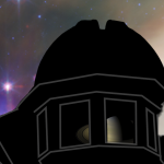
So, time to invoke the modern meaning of the verb “to Photoshop”! I decided I’d graft the dome on in place of a pointed tower roof; lots of old big houses have a circular tower with a pointed roof, and that’s an easy place to put a circular dome. Furthermore, since we’re using the sky shot and emphasizing the astronomy, let’s render the house in silhouette.
So, now the hunt for houses. I ended up using a range of different source material, as models for different parts, and combine them fairly cleanly, with some modifications by me. I did quickly realize I had to somehow indicate window locations and such; a pure silhouette looked really stupid. So those got drawn in in 60 or so vector layers (so I could edit them to look semi-decent; I can’t draw well enough to get even straight lines right the first time). Luckily there are lots of observatory domes on record; easy to trace the outline and adjust the perspective to match the house.

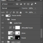
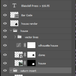
I’m a fairly sophisticated Photoshop user, so the house image you see is constructed from a lot of pieces. Those pieces are kept separate so far as possible; this makes it possible to experiment, refine only the ideas that work, and often change my mind later without having to throw out too much work (the actual work of the idea that didn’t work, yes; but often I don’t have to throw out the bits of associated work that interact with it but don’t depend on it). In particular I’m a huge fan of layer masks, both on actual bitmap image layers and on adjustment layers.

Late in the process, I realized it would be amusing to have a couple of windows show the view through the house to the sky; so I did that. (And, later, change it to showing a different astronomical view; I think it may be too small for people to even notice that, though; but those windows in the tower show through to a Cassini view of Saturn—an angle entirely impossible from Earth.)
I also decided to pinch in the waist of the house a little, to make it just slightly a caricature of a house rather than a “real” house.

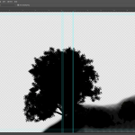
Now we’ve got a house floating in space over an astronomical photo. That’s not really very sensible-looking, even for a fantasy novel, so I decided to provide a ground reference. That’s easy to draw in in silhouette; but on examination, it looked pretty fake. Photoshop to the rescue again—Filter – Render – Tree! Yes, Photoshop has built-in fake trees now. That’s an ash to the left, and a spruce to the right.
There, done. Oh, no, wait; couple of things still needed. The title and author name were at least already decided, but I had to pick font, color, location, and so forth.
The colors came from one of my favorite tricks, picking colors out of the photo. I then adjusted the brightness (“B”) in HSB color-space to make sure it showed up against the background, but without altering the hue. This frequently gets me colors I would never have picked myself, but which go well with the photo and with each other (if the photo is any good to begin with…).
I have no theory for cover fonts (being a duffer and all). I just scrolled through until I found things that looked decent and didn’t seem to me to clash with the rest of the cover. On the front it’s Adobe Caslon Pro Semi-Bold, a classic font with nice clean lines, I thought. There’s a drop-shadow on the title to help separate it from the background a little. On professional covers I frequently see the title and author in different fonts; but that didn’t seem necessary here.
Spines are both hard and easy (spines are only relevant to printed books; for ebooks you only need the one face of the cover, but for printed books you frequently need a “wraparound”, one image that will be the front cover, spine, and back cover). The graphics hardly matter, and the text is very much set: title and author. (Often publisher too, but that’s not important for self-publishing usually; your salesmen won’t be scanning the shelves quickly and trying to see how many of the books from your publisher are shelved in a store.) Used the same font and colors here, though a less bold version. And on the spine it’s nearly always right to make the title and author as big as possible.
To get this cover right, I first had to know how many pages were in the book. This told me that the spine needed to be .7882 inches thick. Then they warned me that I shouldn’t count on the spine folds being really exact, and that I should keep vital content at least 1/16″ away from the spine edges. Be sure to read and follow the restrictions given by your printer!

So, in the end this is a 1.06GB Photoshop file with a lot of layers—beyond the ones shown here, there really are 60 buried in the “vector lines” group. Because of how much adjustment I’m doing I started with 16-bit (per channel) color, which doubles the file size, plus I’m doing it double size at printing resolution; so in fact the file is 8 times as big as a final copy needs to be. But it’s useful to have slack when working!
It’s common to use some space on the front or back cover for a “blurb” about the book, or to reproduce reviews. I’m not doing that here, because I expect our sales channels will be nearly entirely online, and that the sales in bookstores will be in specialty stores where people looking for this specific book come by. Hence, the promotional material doesn’t really help much. I think. You may disagree, or may just be selling your book in a different environment.