Okay, I’ve made surprisingly good time on the next cover, and have one which is getting close to ready even before I have the text all cleaned up.
This one started from one of my own photos, so let’s start there:
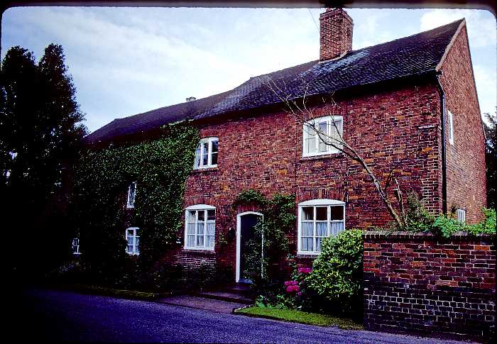
It’s really too large, and it’s brick rather than stone, but it’s not a bad starting point. Reducing it to B&W will make the brick less obtrusive, and simply cropping down will both make the doorway (and doorstep) more prominent, and hide the size of the entire building.
And I ended up here:

The biggest change to the main photo was applying the “rubber stamp” filter from the filter gallery to it. To get that to work out nicely, though, I had to adjust the curtains behind the windows, and the roof, and a number of other things. If you overlay the images you’ll find I’ve also performed some perspective distortion on the house—not actually important for this relatively tight crop, but I did it when the entire house was showing in a wraparound, and it was important there.

The house was done in two pieces; first I cropped and adjusted and prepared it for filtering, in four layers. The base layer is simply the image (with layer mask to clip the house out of the background). Then there’s a retouch layer which suppresses some things that are emphasized by the rubber stamp treatment. Then a curves layer with layer mask to brighten up foliage so it doesn’t go all black in the rubber stamp, and a curves layer with layer mask to darken the curtains inside the windows so the windows don’t go all white.

Then, that image was made one piece in the cover design. Working up, that image was placed to fit the front cover, the perspective was corrected, and the rubber stamp effect was applied. The opacity of that layer was reduced to get the gray I wanted (that was easier than repeating rubber stamp with different foreground colors selected until I found one I liked).
A simple color layer with “darken” blending mode applies the “background” color (this was easier than masking the rubber stamp group, I thought). Then the layer over that applies a very subtle texture to that background color, to keep it from looking perfectly flat.
The rest is really simple—text elements for title and author on cover and spine, the two cats (the white one will probably get more complicated, see below), the publisher and price on the back cover (and the background rectangle that makes it visible against the background), the author photo, the credit for the author photo, and the author biography.
I’m reasonably pleased with this, and it’s rather different from the last one (though both do involve buildings reduced to low-res B&W representations).
My current issue list for this:
- Not satisfied with the white cat’s face
- Not satisfied with roof detail on left half
- Add extract from review to back—maybe at the top rather than the bottom
- Still doubtful about front text color
- Doubtful about using white for Pamela’s name on the spine
- Not sure about the background color
- Not sure about the very subtle texture applied to the background color