I’ve spent a lot of my life picking photos—the ones to keep, the ones to print, the ones to give a client, the ones to put online, the ones to show friends. All sorts of different constraints and considerations apply. (To confuse things, this process is sometimes called “editing”; traditionally a photo editor at a newspaper, or highschool yearbook, is responsible for selecting the photos to publish.)
I found some years ago that housemates looking over my shoulder often want me to display a larger percentage of the photos I shot than I generally do. I, on the other hand, think I ought to be considerably more selective than I am for the snapshot album exhibits.
So, here are some examples and thoughts on the question, based on part of one roll I scanned this last week. The photos are from Keycon 7 (1990), in Winnipeg.
I’m discussing these as snapshots (pictures of people you know) or photojournalism (snapshots of people you follow at a distance), not as art!
I’m going to show you the contact sheet, and then the ones I scanned, and for a few of those explain why they don’t show in the final collection, or why they do. (The scan decision was made with this article in mind; I scanned some just so I could exhibit them in this article.)
(A “contact sheet” used to be made by putting the negatives on a sheet of photo paper in the darkroom, putting a sheet of glass over them, exposing for a measured time using the enlarger or some controllable light source, and then developing the sheet of paper. This gave you a nice index of all the negatives on that roll on one sheet, all at the same exposure so you could predict exposures for later pictures once you’d made a good print of an earlier picture. This so-called contact sheet is a scan of the negatives in their Print File archival storage page on a flatbed scanner with transparency capability.)
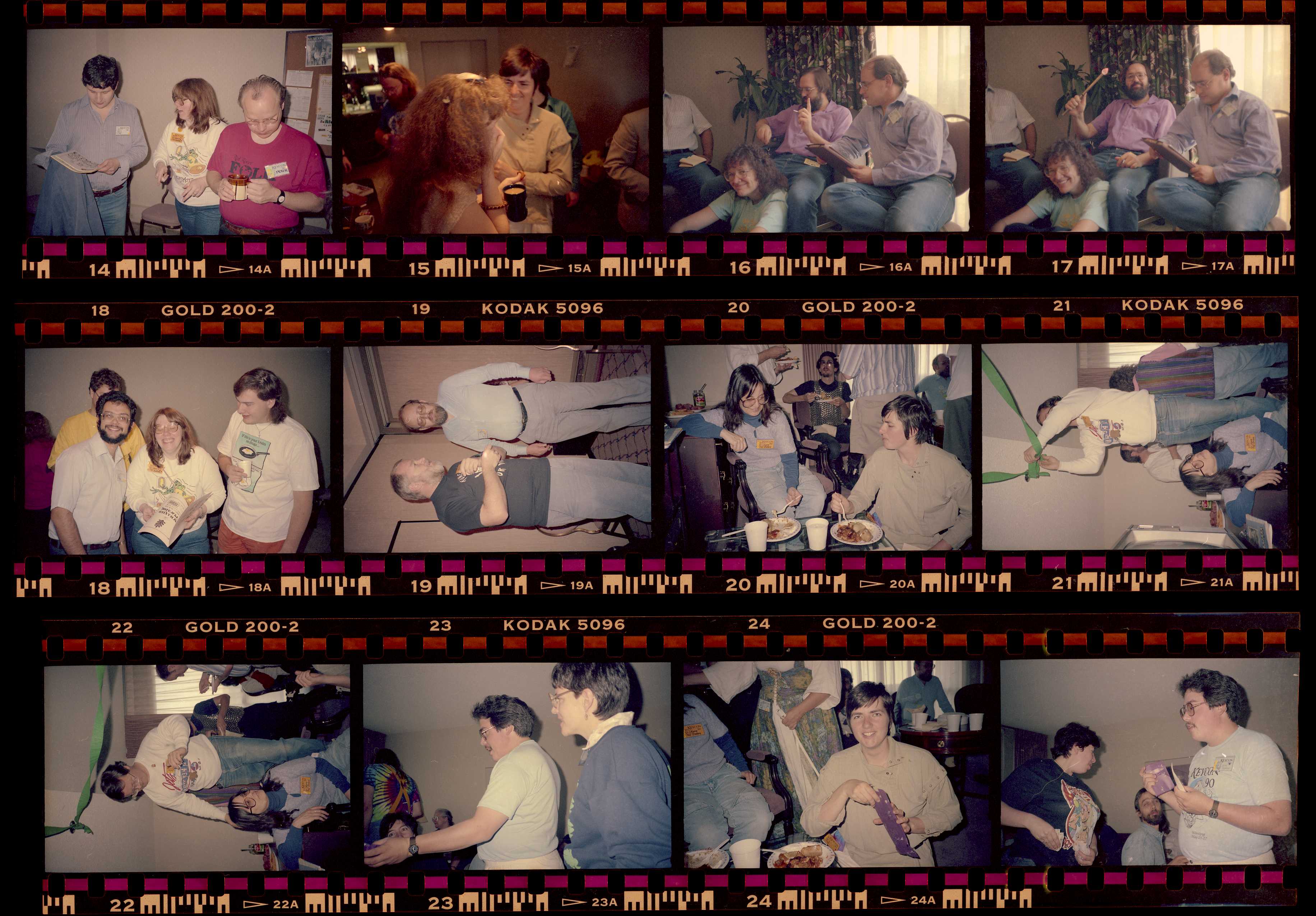
We’ll just go through them in order. I’ll be identifying them by the negative number, which you can see below the photo in the edge printing (also above, except on the first row where it was cropped off).
#14
 This one is mediocre, but I ended up including it. Nobody shows their face that well (the two at the edges are both looking quite a bit down, and Geri in the center is looking sideways. Also Peter on the right isn’t at all interacting with the other two. Still, they’re all in focus and decently exposed.
#15
Didn’t scan this at all. Ruth is half behind the head of hair in the foreground. There really doesn’t seem to be much point to this photo as it turned out. Probably I didn’t see the foreground person coming.
#16
 This is a bit sketchy technically; underexposed, and I haven’t manage a great job on color correction. However, the two people in back are clearly interacting, plus what makes it, the person sitting on the floor smiling up at the camera. This ends up being a semi-decent picture.
#17
Alternate version of 16; the lighted wand in the back is interesting but doesn’t really communicate anything. However, the great expression in the front is missing, so this was not the one I chose.
#18
 The flaw here is the person in yellow in the background. They’re too hidden to contribute anything, but the bright yellow and enough face to get your attention are still there. However, the three in front are great; Geri’s eyes are closed, but she’s so clearly laughing hard that’s okay, and the two flanking her are clearly engaged. This is pretty decent.
#19
 Wanted a photo of Dave Clement, and this one is decent, but Nate’s eyes are closed, so the photo as a whole doesn’t do much good. If photos of Dave were seriously rare I’d just crop this down or something, but while I don’t seem to have another on this roll, I’ve got hundreds through the collection as a whole; not rare. I scanned this so you could see for sure Nate’s eyes are closed, I could tell from the contact sheet.
#20
 Best one so far, I think. Fairly nice of both Kara and Ruth, and they’re clearly having an interesting conversation as well as eating dinner. Distracting background, but the flash exposure has brought the foreground up enough that the background is rather suppressed, and that’s generally unavoidable in snapshots anyway.
#21
 This could have been interesting, but my timing was off, so the guy on the chair completely disappears behind his arm.
#22
 Missed this one first time through, but it’s actually quite nice, and shows us who the person on the chair in the previous shot was.
#23
No scan, no hope. Victor’s hand blocking Beth’s face, Polly a bit out of focus. Again, if Victor was a terribly rare find I’d use this in some way, but he isn’t.
#24
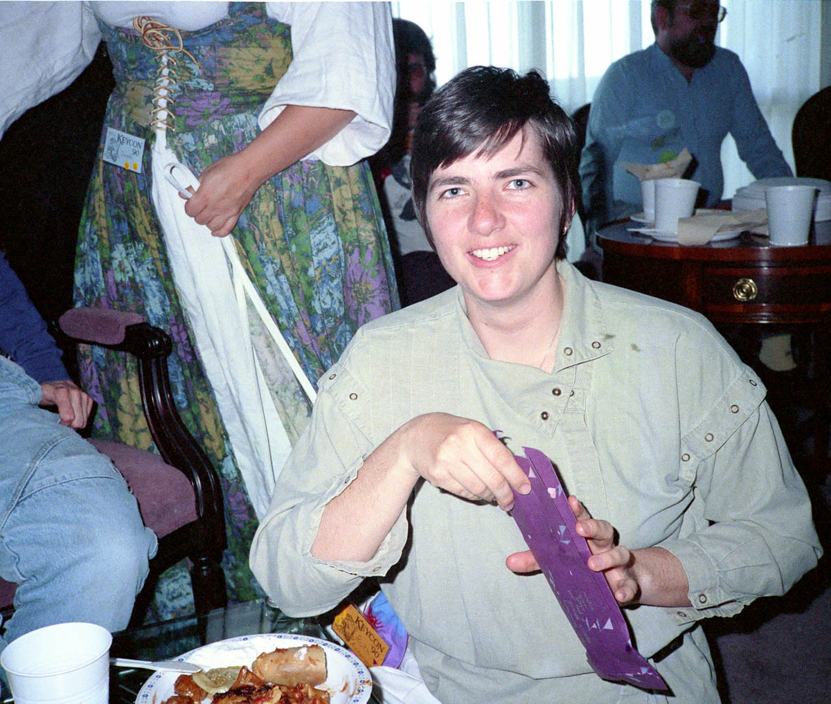 Ruth getting something out of a bag. Fairly nice.
#25
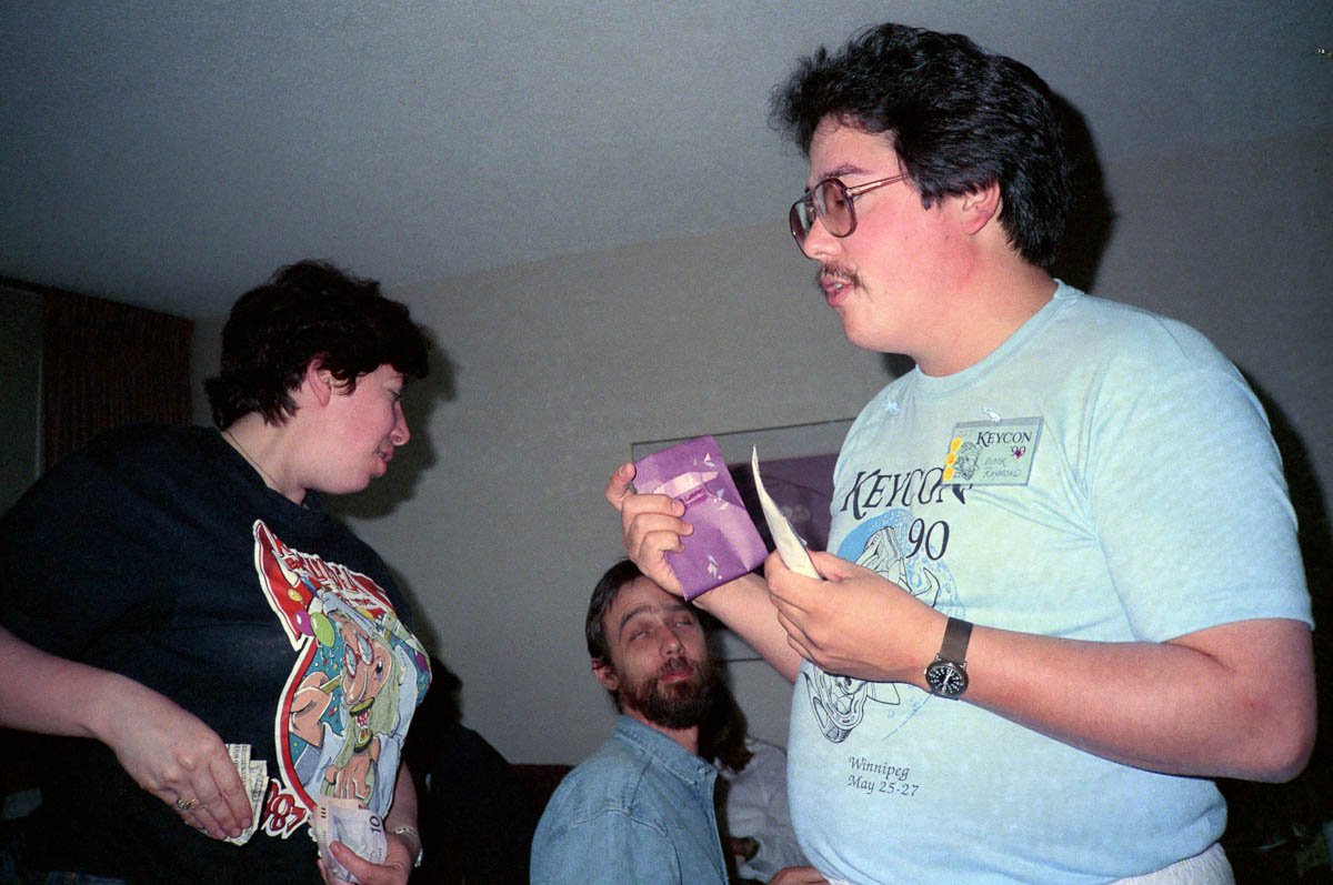 Mostly bad. Victor could probably be extracted if pictures of Victor were rare, but we just dealt with that above. Beth is interacting with the person behind Victor’s hand, and that person is, um, not looking their best in this shot. No point in this one.