Well, and here we finally are.
I’m evaluating these raw processors for my own use in my own workflow. My primary use for raw processors is for processing bulk photos into “semi-custom” quality; vaguely like what a pro lab in the film era would produce as “video-analyzed proofs”, where a human had glanced at each photo for a second or two and made some very quick adjustments. I use this for batches of hundreds of photos from events ranging from science fiction conventions to roller derby bouts. Because most of my work is by available light when there isn’t much light available, noise reduction capabilities are important to me; if you shoot outside in the sun, or in a studio with all the lights you can fit, your needs will certainly differ. I use a different workflow for images that I’m taking the time to push to the “custom print” or higher levels; those go through Adobe Camera Raw and Photoshop CS6, and get a deal more work (usually multiple curves adjustment layers with layer masks, plus some bitmap layers with masks or unusual blending modes). That means I’m not looking at all at any issues with driving a printer in these raw processors, or doing very much with some of the fancier features, especially local adjustments. I am looking a lot at the ability to usefully copy settings from one photo to a group of others. So, I apologize to any products that are marvelous, but don’t fit my particular needs too well. I’m trying to be clear about the limits of my interests here, in hopes of not damaging anybody.
Since I’m learning most of these products for the first time, it’s inevitable that I’m not going to get the best out of each of them. I apologize in advance to anybody who gets poor ratings in some area because I didn’t figure out how to use it! (Email me, and if I agree I’ll fix my articles).
Finally, I have not tried to come up with objective measures for various characteristics. These reviews are, in the end, entirely subjective. I try to explain why I feel the way I do in ways that will help people decide if they care what I think, but it’s entirely possible that somebody will have very different views from mine even if their needs are very similar.
I’m making my work public because it seems a shame not to, and because I hope I may get feedback correcting any mistakes I make (before they lead me to choose the wrong product).
I’ve noted things I could improve here and there, rather than actually improving them. I’m afraid of the best becoming the enemy of the good, and my spending huge amounts of time on this project making it better and better—and never quite being ready to publish it.
Mostly, what I have here is the final images I produced from each of the images in each of the processors. Sometimes my ideas for the image may have evolved during the process, too, just to complicate things. And there are formatting issues, and the full-size images are pretty large.
(Because there was a checkbox, the galleries of results for each photo are presented in random order. This means you aren’t always viewing the products in the same order. This seems good for avoiding some small risk of bias.)
Derby
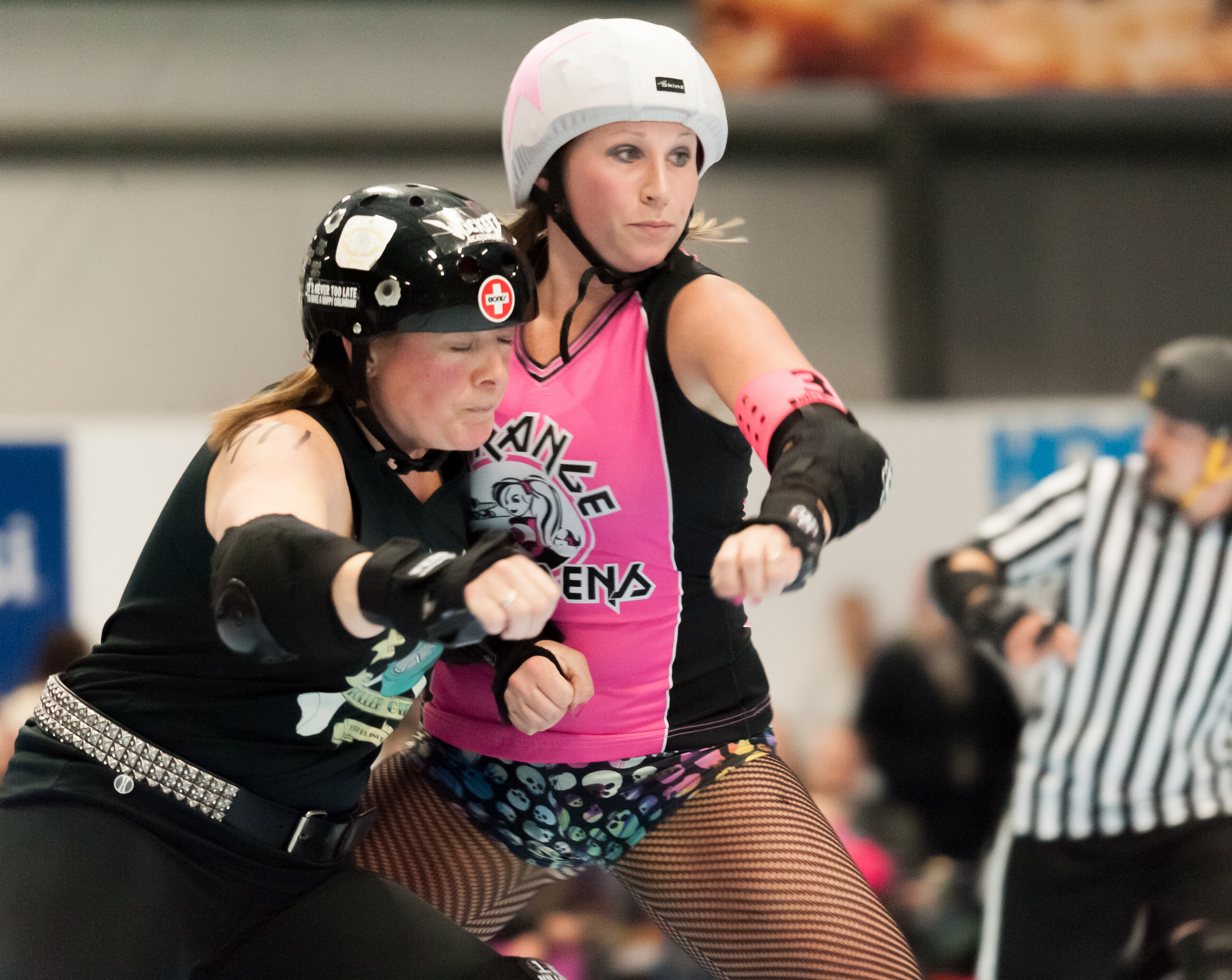
This photo was shot with a Nikon D700 and Sigma 120-400mm lens at 270mm, ISO 6400, 1/250 sec. at f/5.6 and saved as a NEF (raw) file.
I’ve chosen very similar croppings in each case, and at thumbnail size these look pretty similar.
Like many sports shots, especially below the top professional levels, this one has some technical flaws. The woman with the whit helmet cover isn’t actually quite sharp. I think this is an actual focus issue, not a shutter-speed issue, but it’s hard to be sure at this level. I was already shooting at ISO 6400 at f/5.6, which was wide open on this lens. Being able to stop down another stop would probably have helped, but I certainly couldn’t give up a stop of shutter speed.
Looked at full-size, they differ quite a lot, though. I think the key points are the white helmet cover the taller woman is wearing (degree of detail in the highlights), the texture of the flushed patch on the cheek of the woman, and the background texture (say just to the right of the taller woman).
Aftershot: noise all well-controlled. Detail remains pretty good. Highlight details good, too.
Photo Ninja: noise maybe just a hair better controlled. Helmet cover highlight just a bit better. Color balance is either a question of my eye at the moment of processing (I’ve worked on these over two weeks). I seem to remember white-balancing on the same stripe of the referee at right in all cases, though.
Darktable: Noise remarkably well controlled, but maybe pushed too far; the near woman’s face is looking a bit plastic. Helmet cover highlights a bit missing (not really important in this image, but shows differences). I probably should have made it brighter here.
LightZone: Noise pretty bad. Helmet cover highlights not too good. I have made this one brighter, maybe a hair too much so.
Capture one: Noise kind of okay, helmet cover highlights bad, brightness about right maybe (but cover got away then).
Lightroom: Noise decent enough, highlights a bit gone.
DxO: Noise is a problem. Nothing really matches Noise Ninja (even 2, but 3 is better) in this test.
Dr. Mike
This photo was shot with a Fuji FinePix S2 Pro and a 70-200/2.8 lens at 115mm, ISO 1600, 1/60 sec., f/2.8. It was saved in JPEG mode.
This considerably older camera doesn’t have as good low-light performance as the D700, so ISO 1600 still requires considerable help with noise reduction. The lighting also isn’t very good. It’s room light, in hotel function space, so the face turned down is rather shadowed.
(The subject is the late John M. Ford. This was from his “Ask Dr. Mike” show at Minicon in 2003.)
There’s more variation in cropping this time, though not massive. I did straighten the picture in all cases, anyway. Color balance also varies a lot, and I tend to prefer the middle positions.
Since this is from a JPEG file, we can’t do much about highlight recovery. The shoulder of the lab coat and some of the collar are definitely burned out. Doesn’t harm the picture that much, though.
The black shirt is horrible for noise (and needed considerable adjustment of the black point to make it look tolerable at all). The shadow above the right edge of his mouth is a particular problem, and below the chin.
Lightzone: Shirt has lots of big blobs. Forehead and cheek aren’t really too bad. Upper lip and shadows on chin are awful, though. I could pick settings that were less bad there, but they don’t do nearly as well on the forehead and cheek then.
Capture One: Shirt is cleaner, with less black point assist than LightZone. Cheek isn’t as nicely cleaned up but chin exhibits fewer noxious artifacts. Not bad really.
Aftershot: Nice noise cleanup (go Noise Ninja). Just a little cold on the white balance.
DarkTable: Overly smoothed but still didn’t reduce noise enough. Shirt isn’t showing nasty aftifacts so much though.
Lightroom: Maybe a bit cold. Shirt is both blobby and blue (but fixing white balance might fix that). Noise doesn’t really look that bad (because I chose to leave it being somewhat obtrusive rather than push until I got artifacts). Some might argue that I’m more bothered by noise than I should be, and shouldn’t work so hard to reduce it.
Photo Ninja: Face could be lighter I think. Shirt is reasonably clean and not blacked out. Noise reduction pretty decent leaving lots of skin texture.
DxO: seemed easy enough to get what I could fixed. Shooting jpeg is not a good idea :-).
Minnehaha
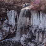
This was shot with a Fuji Finepix S2 Pro at 28mm (I think the Tokina 28-70 ATX Pro), ISO 200, 1/250 sec. f/8, saved as a RAF (raw) file.
The conditions weren’t really very good for this photo, the direct sun on the water at the top of the falls with the rest of the face in fairly deep shade leads to distinct problems. There’s also a big magenta ghost reflection at upper right, demonstrating the nicely circular aperture on that lens.
Some of the processors didn’t get on with the Fuji raw file (which is admittedly one of the weirder ones).
Capture One: I let the sunlit water get a bit away in this version, to bring up the detail in the face some. I’m reasonably happy with this given the problems in the initial exposure. I did use masking to bring down the top water highlights some.
Darktable: although it got an image out of this file, there’s an obtrusive pattern over it. This is not a usable conversion (and I didn’t do much of any work to optimize it). Note that the water at the top is not really very burned out.
Lightroom: Not enough contrast, I lost the color in the ice on the face, and the face is too dark. This is all on me, though, there’s nothing I remember about Lightroom that made me do any of those.
Photo Ninja: Boy, look at that sunlit water! Now that’s highlight recovery. I did let the color balance go too yellow (and lost the cyan in the ice on the face mostly, though there are traces left especially on the left).
Naomi
Shot with a Nikon D200, 50mm lens, ISO 800, 1/30 sec. f/2.8. I’m not sure if that “50mm” is that setting on the 28-80 Tokina zoom, or the Nikkor 17-55/2.8, or my old Nikkor 50/1.8 AIS. Saved as a JPEG file.
These are close to identical (by the standards of this comparison, where I processed them individually by eye and didn’t go back to bring them into convergence later). This turned out to be an uninteresting test photo.
Purple Flower
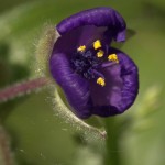
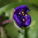
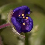
Shot with an Olympus EPL-2 and 60mm f/2.8 macro lens. ISO 400, 1/500 sec., f/8 and saved as an ORF (raw) file.
None of these really quite works for me (there are other shots from that day that I like a lot, though). I don’t have the plane of focus quite where it needs to be I don’t think (there was too much wind to shoot on a tripod, and much of the focus plane placement is luck or at least selection from among a random assortment). And I haven’t made the colors do quite the right things in any of them. Which in some ways makes it an interesting test photo.
Lightzone: Colors do look mostly good in the flower. The background is just a bit olive. Capture One: Less red, background more olive. A bit darker. All that’s me, not a difference in the programs, though.
Aftershot: More red in this one. Definitely too dark. All me again.
Darktable: Local contrast in the flower is bad, and it’s too dark. I had trouble getting this any better in Dark Table, though.
Lightroom: Yeah, that’s about what I can do with this. Was quick and easy in Lightroom.
Photo Ninja: Colors look cleaner to me, and I see more definition in the flower sex bits inside there. That is the processor.
DxO: The micro-contrast tool was nice to work with here.
Doc Smith Books
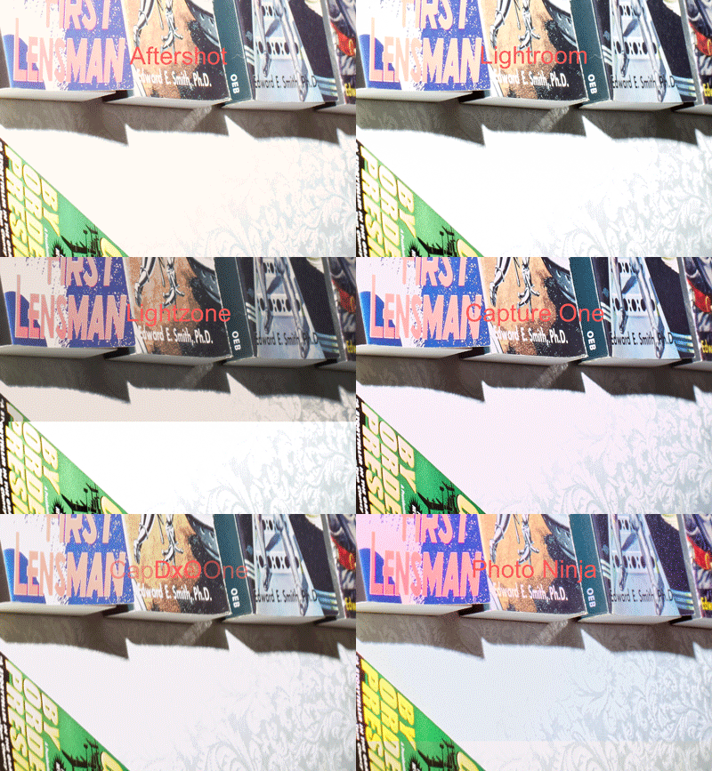
This is the only artificial test shot included, and the only one I shot specifically for this test. This is intended only as a semi-objective (not quantitative) test of highlight recovery capability. There is a direct flash on the far side of the books, at about camera level, so that the light decreases with distance along the line of books. The book covers provide some fairly normal image content, and the brocade pattern in the tablecloth provides highlight detail. The exposure was set so that the near edge was several stops overexposed, to ensure that the limits of even exceptional highlight recovery would be visible.
(The one experiment where the brocade was much less recoverable was when I used Adobe Camera Raw and rendered into Adobe RGB 24-bit. That really lost me a lot. As I have found before, using a big space like ProPhoto RGB in 48-bit mode helps a lot.)
My reading of the test images is that there are clear differences in highlight recovery (though some of them could have been caused by other changes I also made; I tried to not do that, but I could have slipped). The order, from best to worst, of the processors for highlight recovery is:
- Photo Ninja
- DxO Optics Pro
- Capture One Pro
- Lightzone
- Lightroom
- Corel Aftershot Pro
It’s hard to see at all clearly with single images on the page, so I’ve made an animated GIF that flips through them in order, with each processor labeled.
Tux Cat
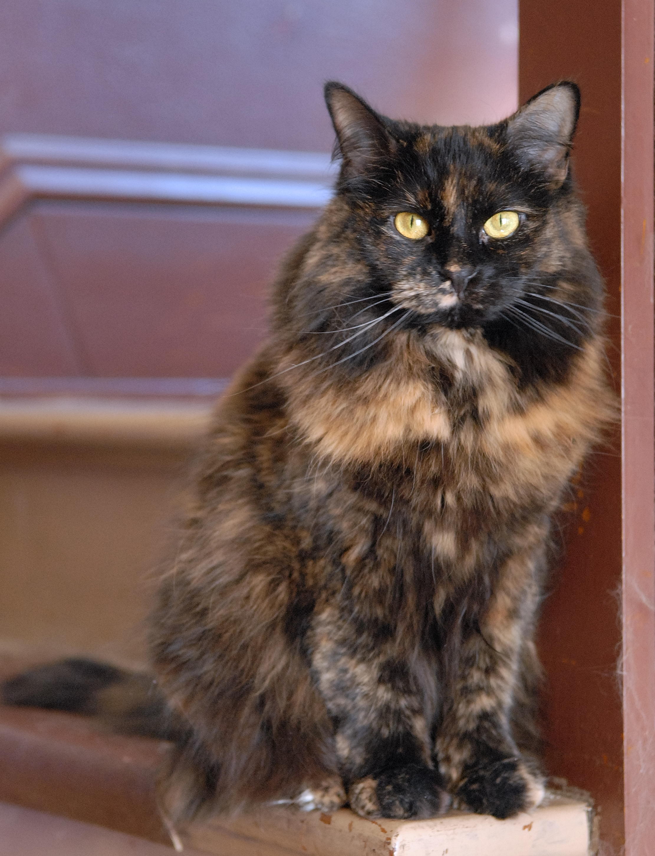
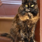
Shot with a Fuji Finepix S2 Pro at Sigma 105mm macro lens. ISO 200, 1/60 sec., f/4.8, saved as an RAF (raw) file.
Lightzone: This is maybe a bit too muted in color, but not tinted. The white fur areas have held up very well.
Photo Ninja: right on in color, I think. And very quickly achieved. I like the white fur and the black both, too.
Capture One: I let the white leg in the foreground kind of get away from me; I pushed this for a bit more contrast in general, and I think I overdid it.
Lightroom: Nice detail and contrast, but I let the color get away just a bit, that carpet looks actively fake now.
Final Conclusions
This was fascinating, I’m very glad I took the trouble to tackle this project this seriously. While this won’t pass muster as a set of serious product reviews (I think I’ve been adequately careful to deny that intention), it records my reactions and opinions pretty well and shows some basis for them.
And I’ve learned a lot about raw processors I’d never used, in some cases never heard of, before.
First the good: The worst of them were somewhat better than I was afraid would be common.
Especially, the free software examples show a smoothness and sophistication of user interface, and a high level of capabilities, that I’m not used to finding in free photo software. (I’m quite familiar with free software and use it extensively and love the idea a lot; I use Linux and Solaris / Illumos regularly, and Emacs and Perl and MySql and Apache web server and PHP and GCC and the whole Gnu command line toolset. Its area of strength isn’t generally smooth and sophisticated GUI.)
And the bad: none of them are a good replacement for what I’ve been using. I can continue using Aftershot for the time being, until I get a new camera body my old version doesn’t support (new versions lack Noise Ninja integration), and by then things may have improved. But, right now, while the quality of many of them is quite good enough (and Photo Ninja seems clearly better to my eye), the responsiveness of the editing UI is not good enough in any of them except Lightroom. Lightroom has noise reduction problems (maybe spending more than the sale price of Lightroom on Topaz denoise, using it through their Lightroom integration interface, and learning to use it well would solve that).
The performance of all of these rendering files at various resolutions is also far slower than Aftershot (and Bibble before it) achieved, but that’s not tremendously important for my workflow. What’s an actual problem is UI responsiveness.
I think this is how about everybody works: I see something I think is not quite right, and set out to fix it. I pick a tool. Then what I do is adjust the slider (or whatever UI element) for that tool and watch what happens, and see if this is going to make the thing I’m fixing better.
For this to work well, the screen area being previewed needs to snap back and forth quite sharply between states as I adjust the control. In Photo Ninja, I can often see the tiles of image being updated individually; that’s far too slow. (For complex things, like noise reduction, really instantaneous response is no doubt technically impossible, and I’ll have to live with that of course.)
The way the human eye and brain process images, it’s really valuable to have sharp, clean switches between versions of the photo, and for exactly when that happened to be obvious (and quick). I have to switch back and forth a lot more times when the switch is sluggish.
So. Photo Ninja is the one that strikes my fancy best. The big flaw with it is UI responsiveness, and I hope that comes up reasonably soon on their worklist (I know it’s on their list). From the web site it looks like they have a very small development team, which sometimes makes things slow. It’s also more focused; it doesn’t try to own your photo catalog to, it just edits (it has a browser for finding photos in your filesystem, but it also integrates well with Photo Mechanic); that also fits my preferences very well, I prefer products that are really good at doing their core thing, and don’t try to do much else. I have hopes that they’ll do some work on editing responsiveness. I will say that I think I get the best results, most easily, out of Photo Ninja. This fits very well with my workflow, where getting semi-custom quality results quickly is the key. With the current level of responsiveness it’s still pretty usable, especially for smaller sets of photos.
DarkTable and LightZone are both free software (DarkTable does not run on Windows, LightZone does; they both run on Linux and FreeBSD and OS X). They’re quite sophisticated and do good work The UI responsiveness isn’t very good with them, either.
Capture One Pro is the big dog in some sense (been around for a while, heavily used by professionals, now shipping with most medium-format digital gear). It works fine, is a bit sluggish in UI response still, and didn’t really capture my heart. It has considerable capability to do local adjustments, which mostly doesn’t matter to me, but makes it closer to a good complete replacement for Photoshop for those not trying to achieve “fine printing” levels. It’s also the most expensive by a lot.
Lightroom is the other big dog (must be many more copies out there than Capture One). Being annoyed with Adobe was part of why I started this (hoping to avoid being chased to Lightroom by the collapse of Bibble and Aftershot); it’s the default choice for DSLR photographers. UI responsiveness is good. Capabilities are generally good. Noise reduction, which I use pretty heavily, is a problem area, though. It has weird issues working with anything other than local disk drives, too, which I had to fake my way around and would be afraid might break at any future release of either Windows or Lightroom. And it tries to lock me in by making me use their “catalog”.
So, there you have it. Lots of highly capable products out there, none that I really fell in love with for immediate use. I have some hopes for the future, though, mostly centered on Photo Ninja.

