Raw Processors—Conclusions

Well, and here we finally are.

I’m evaluating these raw processors for my own use in my own workflow. My primary use for raw processors is for processing bulk photos into “semi-custom” quality; vaguely like what a pro lab in the film era would produce as “video-analyzed proofs”, where a human had glanced at each photo for a second or two and made some very quick adjustments. I use this for batches of hundreds of photos from events ranging from science fiction conventions to roller derby bouts. Because most of my work is by available light when there isn’t much light available, noise reduction capabilities are important to me; if you shoot outside in the sun, or in a studio with all the lights you can fit, your needs will certainly differ. I use a different workflow for images that I’m taking the time to push to the “custom print” or higher levels; those go through Adobe Camera Raw and Photoshop CS6, and get a deal more work (usually multiple curves adjustment layers with layer masks, plus some bitmap layers with masks or unusual blending modes). That means I’m not looking at all at any issues with driving a printer in these raw processors, or doing very much with some of the fancier features, especially local adjustments. I am looking a lot at the ability to usefully copy settings from one photo to a group of others.  So, I apologize to any products that are marvelous, but don’t fit my particular needs too well. I’m trying to be clear about the limits of my interests here, in hopes of not damaging anybody.

Since I’m learning most of these products for the first time, it’s inevitable that I’m not going to get the best out of each of them. I apologize in advance to anybody who gets poor ratings in some area because I didn’t figure out how to use it!  (Email me, and if I agree I’ll fix my articles).

Finally, I have not tried to come up with objective measures for various characteristics.  These reviews are, in the end, entirely subjective. I try to explain why I feel the way I do in ways that will help people decide if they care what I think, but it’s entirely possible that somebody will have very different views from mine even if their needs are very similar.

I’m making my work public because it seems a shame not to, and because I hope I may get feedback correcting any mistakes I make (before they lead me to choose the wrong product).

I’ve noted things I could improve here and there, rather than actually improving them. I’m afraid of the best becoming the enemy of the good, and my spending huge amounts of time on this project making it better and better—and never quite being ready to publish it.

Mostly, what I have here is the final images I produced from each of the images in each of the processors.  Sometimes my ideas for the image may have evolved during the process, too, just to complicate things.  And there are formatting issues, and the full-size images are pretty large.

(Because there was a checkbox, the galleries of results for each photo are presented in random order. This means you aren’t always viewing the products in the same order. This seems good for avoiding some small risk of bias.)
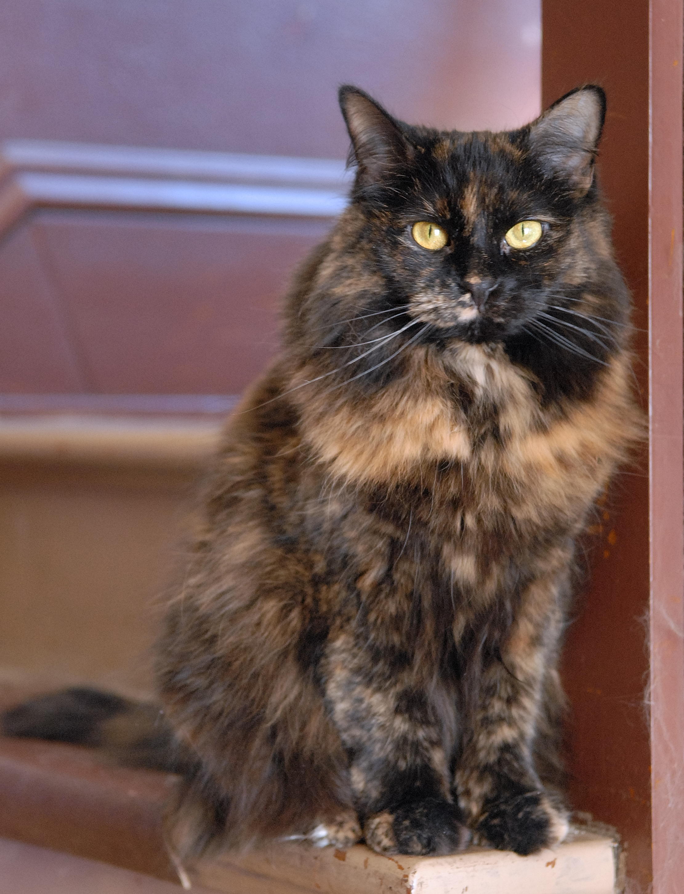
Derby

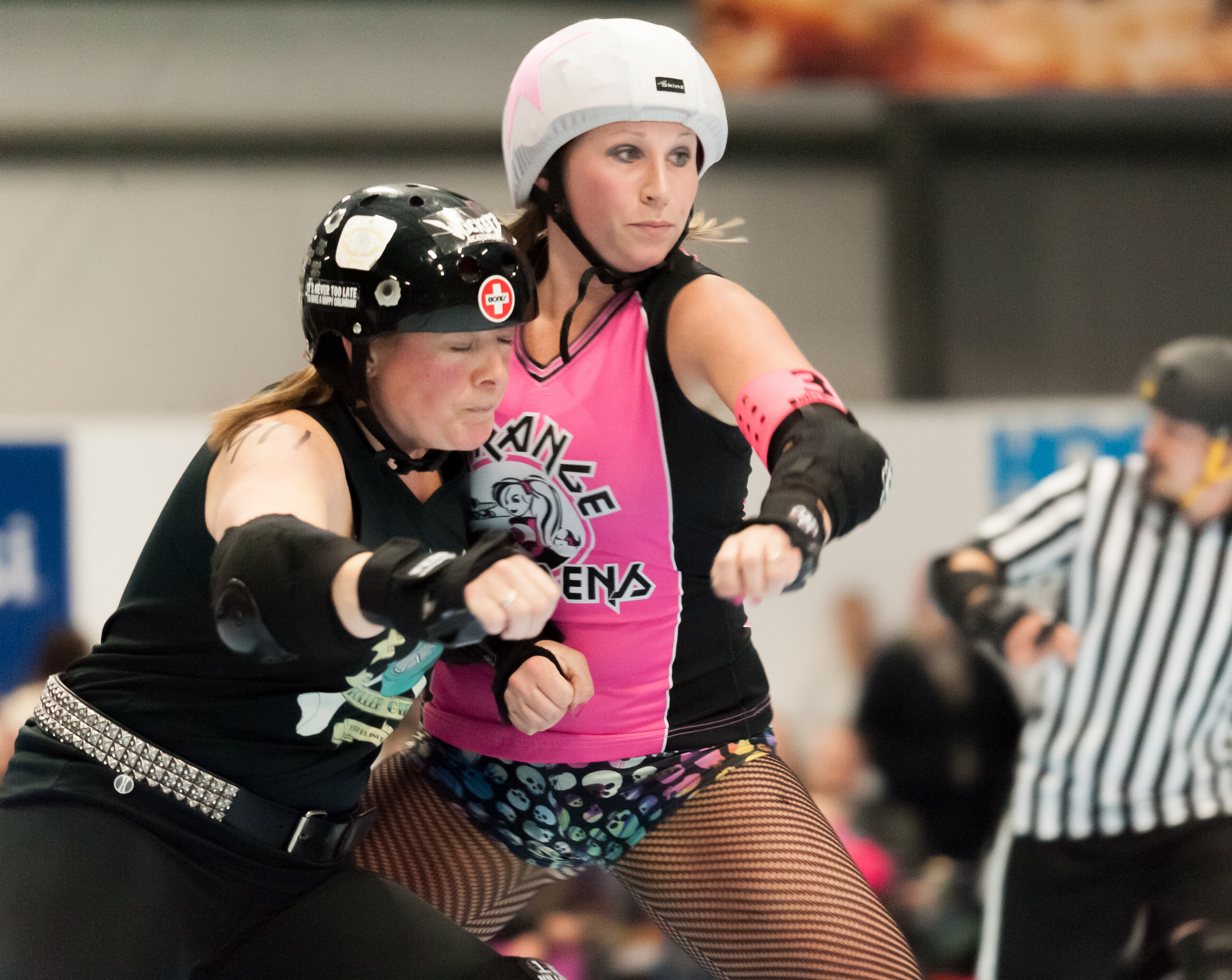
This photo was shot with a Nikon D700 and Sigma 120-400mm lens at 270mm, ISO 6400, 1/250 sec. at f/5.6 and saved as a NEF (raw) file.

I’ve chosen very similar croppings in each case, and at thumbnail size these look pretty similar.

Like many sports shots, especially below the top professional levels, this one has some technical flaws. The woman with the whit helmet cover isn’t actually quite sharp. I think this is an actual focus issue, not a shutter-speed issue, but it’s hard to be sure at this level. I was already shooting at ISO 6400 at f/5.6, which was wide open on this lens.  Being able to stop down another stop would probably have helped, but I certainly couldn’t give up a stop of shutter speed.

Looked at full-size, they differ quite a lot, though.  I think the key points are the white helmet cover the taller woman is wearing (degree of detail in the highlights), the texture of the flushed patch on the cheek of the woman, and the background texture (say just to the right of the taller woman).

Aftershot: noise all well-controlled.  Detail remains pretty good.  Highlight details good, too.

Photo Ninja: noise maybe just a hair better controlled.  Helmet cover highlight just a bit better.  Color balance is either a question of my eye at the moment of processing (I’ve worked on these over two weeks).  I seem to remember white-balancing on the same stripe of the referee at right in all cases, though.

Darktable: Noise remarkably well controlled, but maybe pushed too far; the near woman’s face is looking a bit plastic.  Helmet cover highlights a bit missing (not really important in this image, but shows differences). I probably should have made it brighter here.

LightZone: Noise pretty bad. Helmet cover highlights not too good.  I have made this one brighter, maybe a hair too much so.

Capture one: Noise kind of okay, helmet cover highlights bad, brightness about right maybe (but cover got away then).

Lightroom: Noise decent enough, highlights a bit gone.

DxO: Noise is a problem.  Nothing really matches Noise Ninja (even 2, but 3 is better) in this test.
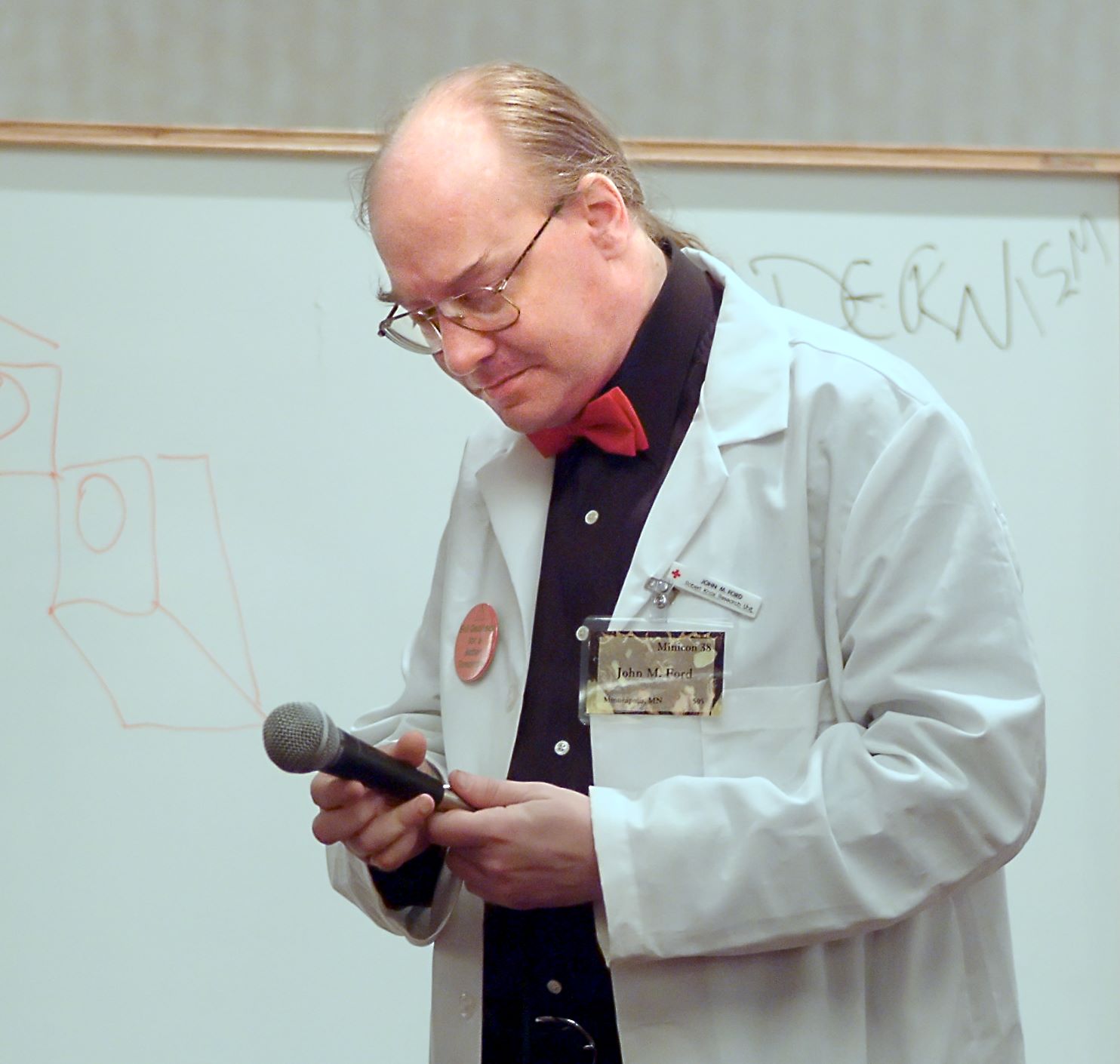
Dr. Mike

This photo was shot with a Fuji FinePix S2 Pro and a 70-200/2.8 lens at 115mm, ISO 1600, 1/60 sec., f/2.8.  It was saved in JPEG mode.

This considerably older camera doesn’t have as good low-light performance as the D700, so ISO 1600 still requires considerable help with noise reduction. The lighting also isn’t very good.  It’s room light, in  hotel function space, so the face turned down is rather shadowed.

(The subject is the late John M. Ford. This was from his “Ask Dr. Mike” show at Minicon in 2003.)

There’s more variation in cropping this time, though not massive. I did straighten the picture in all cases, anyway.  Color balance also varies a lot, and I tend to prefer the middle positions.

Since this is from a JPEG file, we can’t do much about highlight recovery.  The shoulder of the lab coat and some of the collar are definitely burned out. Doesn’t harm the picture that much, though.

The black shirt is horrible for noise (and needed considerable adjustment of the black point to make it look tolerable at all).  The shadow above the right edge of his mouth is a particular problem, and below the chin.

Lightzone: Shirt has lots of big blobs.  Forehead and cheek aren’t really too bad.  Upper lip and shadows on chin are awful, though.  I could pick settings that were less bad there, but they don’t do nearly as well on the forehead and cheek then.

Capture One: Shirt is cleaner, with less black point assist than LightZone. Cheek isn’t as nicely cleaned up but chin exhibits fewer noxious artifacts. Not bad really.

Aftershot: Nice noise cleanup (go Noise Ninja). Just a little cold on the white balance.

DarkTable: Overly smoothed but still didn’t reduce noise enough.  Shirt isn’t showing nasty aftifacts so much though.

Lightroom: Maybe a bit cold. Shirt is both blobby and blue (but fixing white balance might fix that).  Noise doesn’t really look that bad (because I chose to leave it being somewhat obtrusive rather than push until I got artifacts). Some might argue that I’m more bothered by noise than I should be, and shouldn’t work so hard to reduce it.

Photo Ninja: Face could be lighter I think. Shirt is reasonably clean and not blacked out.  Noise reduction pretty decent leaving lots of skin texture.

DxO: seemed easy enough to get what I could fixed.  Shooting jpeg is not a good idea :-).
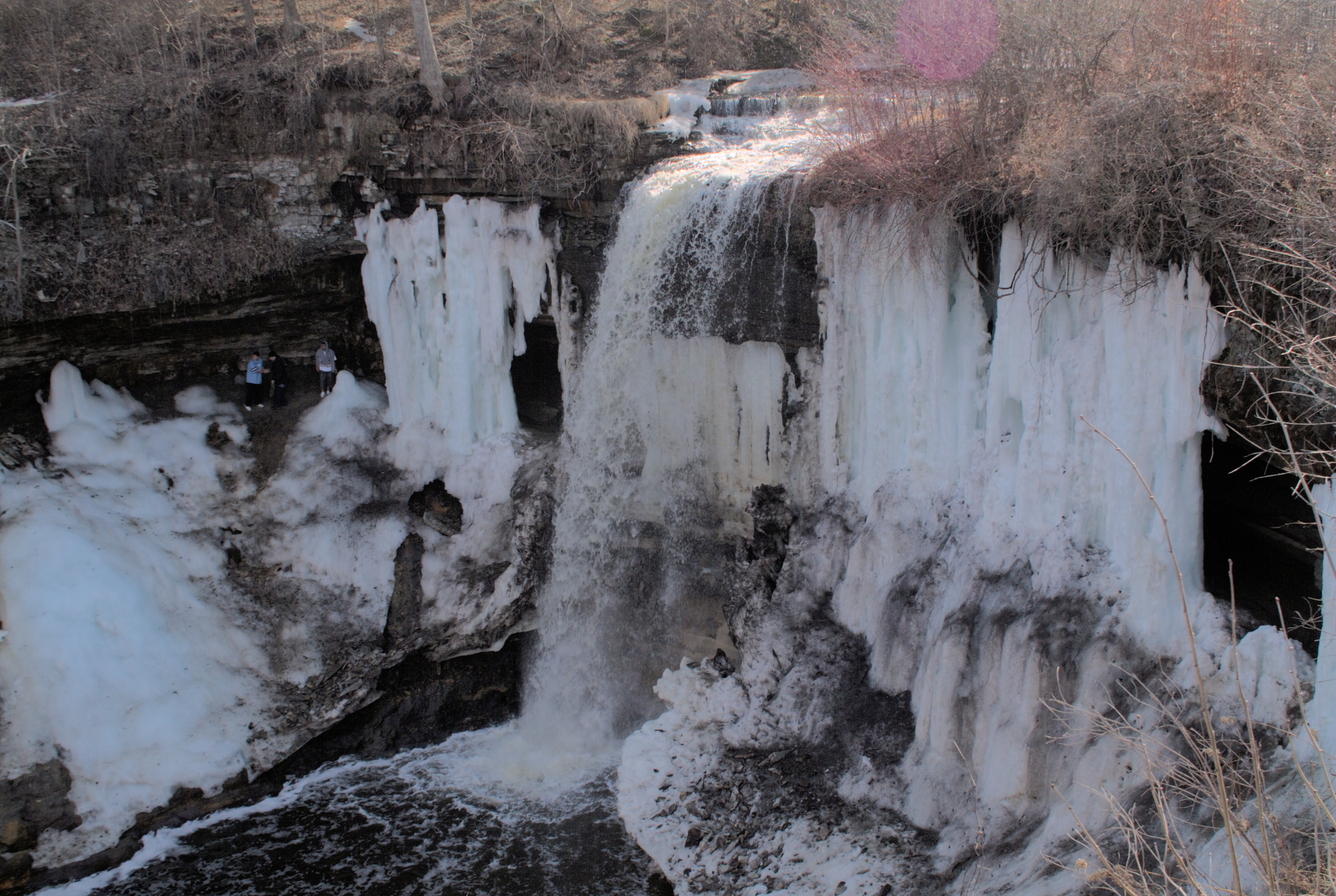
Minnehaha

This was shot with a Fuji Finepix S2 Pro at 28mm (I think the Tokina 28-70 ATX Pro), ISO 200, 1/250 sec. f/8, saved as a RAF (raw) file.

The conditions weren’t really very good for this photo, the direct sun on the water at the top of the falls with the rest of the face in fairly deep shade leads to distinct problems.  There’s also a big magenta ghost reflection at upper right, demonstrating the nicely circular aperture on that lens.

Some of the processors didn’t get on with the Fuji raw file (which is admittedly one of the weirder ones).

Capture One: I let the sunlit water get a bit away in this version, to bring up the detail in the face some.  I’m reasonably happy with this given the problems in the initial exposure.  I did use masking to bring down the top water highlights some.

Darktable: although it got an image out of this file, there’s an obtrusive pattern over it. This is not a usable conversion (and I didn’t do much of any work to optimize it). Note that the water at the top is not really very burned out.

Lightroom: Not enough contrast, I lost the color in the ice on the face, and the face is too dark. This is all on me, though, there’s nothing I remember about Lightroom that made me do any of those.

Photo Ninja: Boy, look at that sunlit water!  Now that’s highlight recovery.  I did let the color balance go too yellow (and lost the cyan in the ice on the face mostly, though there are traces left especially on the left).

Naomi

Shot with a Nikon D200, 50mm lens, ISO 800, 1/30 sec. f/2.8. I’m not sure if that “50mm” is that setting on the 28-80 Tokina zoom, or the Nikkor 17-55/2.8, or my old Nikkor 50/1.8 AIS. Saved as a JPEG file.

These are close to identical (by the standards of this comparison, where I processed them individually by eye and didn’t go back to bring them into convergence later). This turned out to be an uninteresting test photo.

Purple Flower

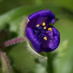
Shot with an Olympus EPL-2 and 60mm f/2.8 macro lens. ISO 400, 1/500 sec., f/8 and saved as an ORF (raw) file.

None of these really quite works for me (there are other shots from that day that I like a lot, though). I don’t have the plane of focus quite where it needs to be I don’t think (there was too much wind to shoot on a tripod, and much of the focus plane placement is luck or at least selection from among a random assortment). And I haven’t made the colors do quite the right things in any of them.  Which in some ways makes it an interesting test photo.

Lightzone: Colors do look mostly good in the flower.  The background is just a bit olive. Capture One: Less red, background more olive.  A bit darker.  All that’s me, not a difference in the programs, though.

Aftershot: More red in this one.  Definitely too dark.  All me again.

Darktable: Local contrast in the flower is bad, and it’s too dark. I had trouble getting this any better in Dark Table, though.

Lightroom: Yeah, that’s about what I can do with this. Was quick and easy in Lightroom.

Photo Ninja: Colors look cleaner to me, and I see more definition in the flower sex bits inside there. That is the processor.

DxO: The micro-contrast tool was nice to work with here.
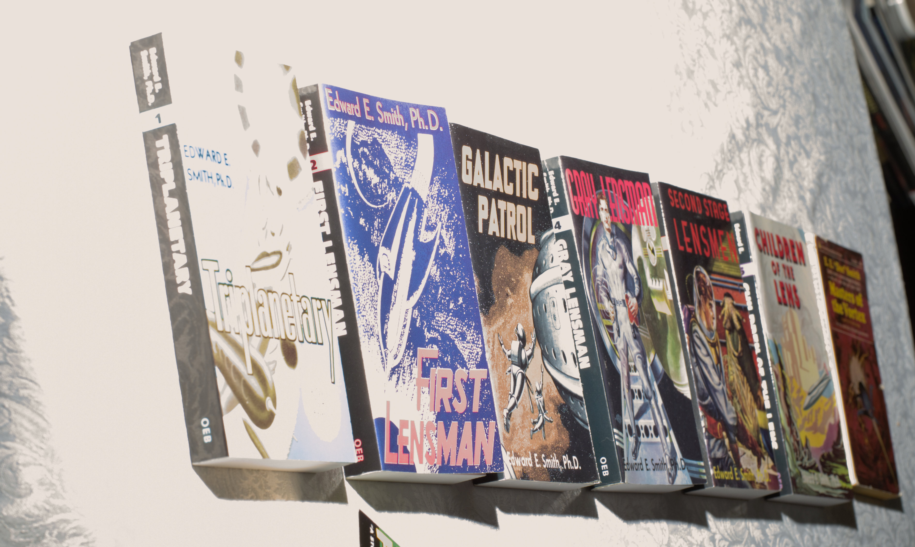
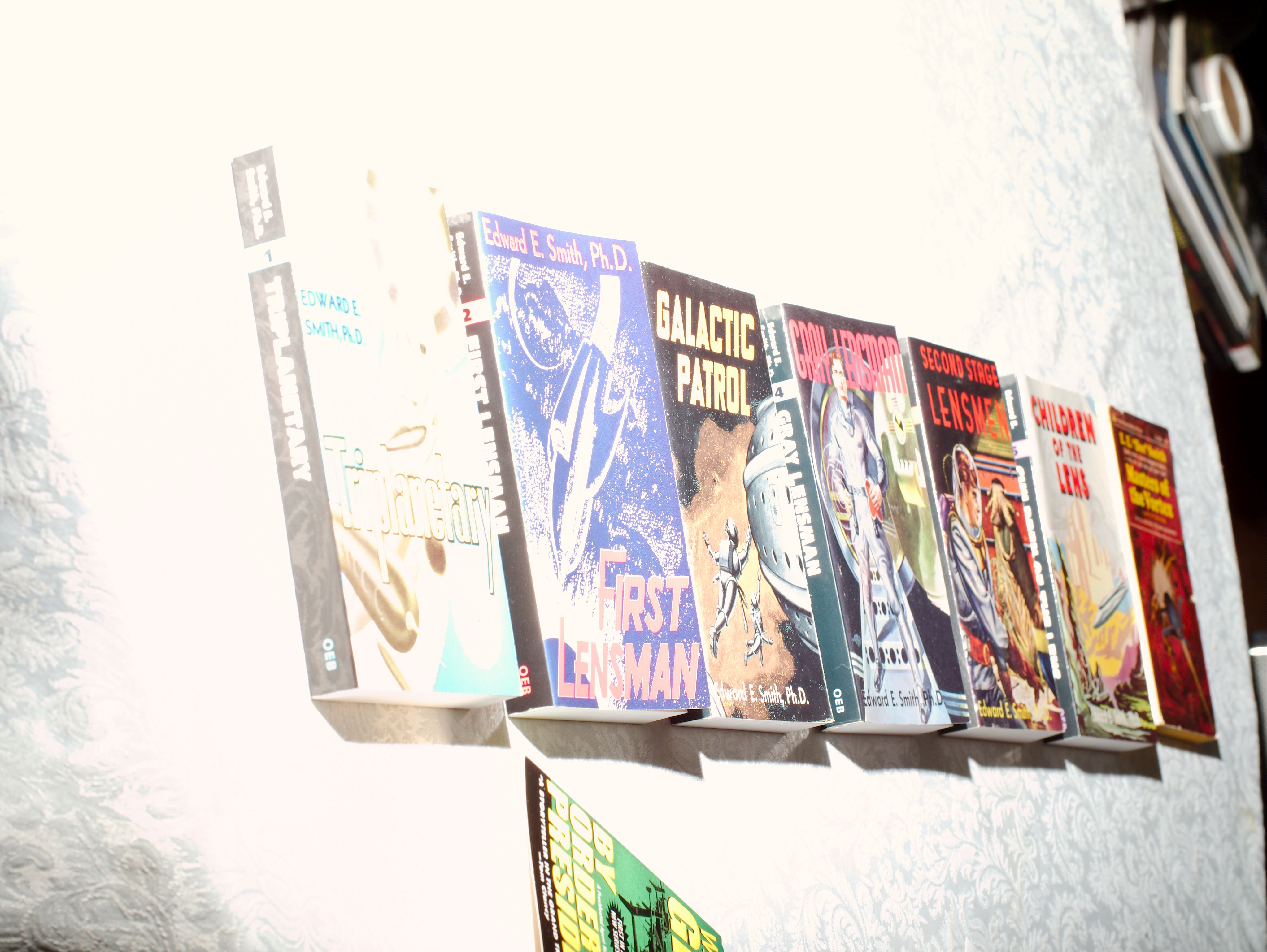
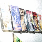
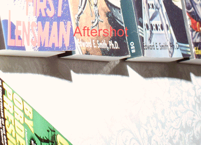
Doc Smith Books

This is the only artificial test shot included, and the only one I shot specifically for this test. This is intended only as a semi-objective (not quantitative) test of highlight recovery capability.  There is a direct flash on the far side of the books, at about camera level, so that the light decreases with distance along the line of books.  The book covers provide some fairly normal image content, and the brocade pattern in the tablecloth provides highlight detail. The exposure was set so that the near edge was several stops overexposed, to ensure that the limits of even exceptional highlight recovery would be visible.

(The one experiment where the brocade was much less recoverable was when I used Adobe Camera Raw and rendered into Adobe RGB 24-bit. That really lost me a lot. As I have found before, using a big space like ProPhoto RGB in 48-bit mode helps a lot.)

My reading of the test images is that there are clear differences in highlight recovery (though some of them could have been caused by other changes I also made; I tried to not do that, but I could have slipped).  The order, from best to worst, of the processors for highlight recovery is:

  1. Photo Ninja
  2. DxO Optics Pro
  3. Capture One Pro
  4. Lightzone
  5. Lightroom
  6. Corel Aftershot Pro

It’s hard to see at all clearly with single images on the page, so I’ve made an animated GIF that flips through them in order, with each processor labeled.
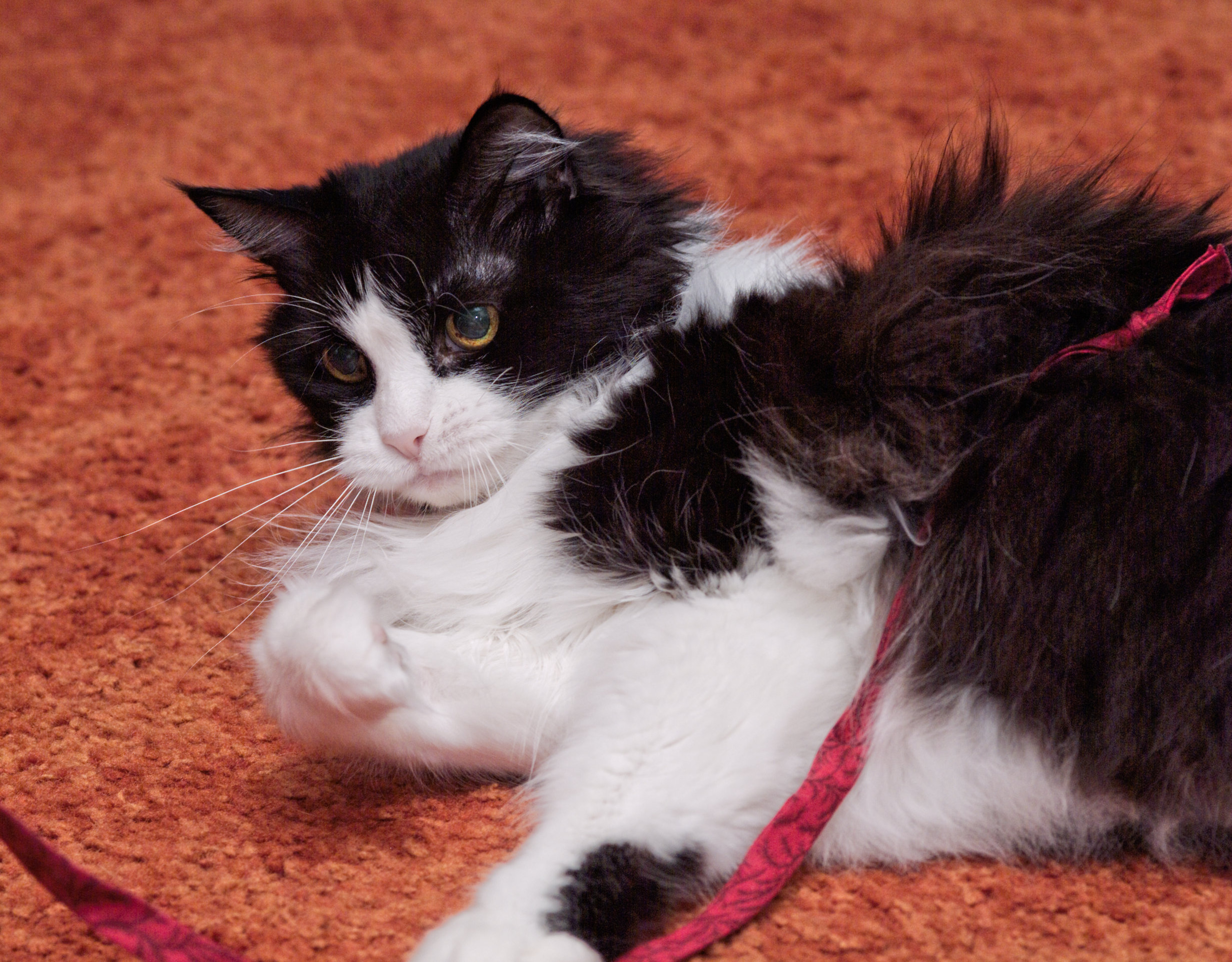
Highlight Recovery Comparison


Tux Cat

Shot with a Fuji Finepix S2 Pro at Sigma 105mm macro lens. ISO 200, 1/60 sec., f/4.8, saved as an RAF (raw) file.

Lightzone: This is maybe a bit too muted in color, but not tinted. The white fur areas have held up very well.

Photo Ninja: right on in color, I think.  And very quickly achieved. I like the white fur and the black both, too.

Capture One: I let the white leg in the foreground kind of get away from me; I pushed this for a bit more contrast in general, and I think I overdid it.

Lightroom: Nice detail and contrast, but I let the color get away just a bit, that carpet looks actively fake now.

Final Conclusions

This was fascinating, I’m very glad I took the trouble to tackle this project this seriously. While this won’t pass muster as a set of serious product reviews (I think I’ve been adequately careful to deny that intention), it records my reactions and opinions pretty well and shows some basis for them.

And I’ve learned a lot about raw processors I’d never used, in some cases never heard of, before.

First the good: The worst of them were somewhat better than I was afraid would be common.

Especially, the free software examples show a smoothness and sophistication of user interface, and a high level of capabilities, that I’m not used to finding in free photo software.  (I’m quite familiar with free software and use it extensively and love the idea a lot; I use Linux and Solaris / Illumos regularly, and Emacs and Perl and MySql and Apache web server and PHP and GCC and the whole Gnu command line toolset. Its area of strength isn’t generally smooth and sophisticated GUI.)

And the bad: none of them are a good replacement for what I’ve been using.  I can continue using Aftershot for the time being, until I get a new camera body my old version doesn’t support (new versions lack Noise Ninja integration), and by then things may have improved.  But, right now, while the quality of many of them is quite good enough (and Photo Ninja seems clearly better to my eye), the responsiveness of the editing UI is not good enough in any of them except Lightroom.  Lightroom has noise reduction problems (maybe spending more than the sale price of Lightroom on Topaz denoise, using it through their Lightroom integration interface, and learning to use it well would solve that).

The performance of all of these rendering files at various resolutions is also far slower than Aftershot (and Bibble before it) achieved, but that’s not tremendously important for my workflow.  What’s an actual problem is UI responsiveness.

I think this is how about everybody works: I see something I think is not quite right, and set out to fix it. I pick a tool. Then what I do is adjust the slider (or whatever UI element) for that tool and watch what happens, and see if this is going to make the thing I’m fixing better.

For this to work well, the screen area being previewed needs to snap back and forth quite sharply between states as I adjust the control.  In Photo Ninja, I can often see the tiles of image being updated individually; that’s far too slow.  (For complex things, like noise reduction, really instantaneous response is no doubt technically impossible, and I’ll have to live with that of course.)

The way the human eye and brain process images, it’s really valuable to have sharp, clean switches between versions of the photo, and for exactly when that happened to be obvious (and quick).  I have to switch back and forth a lot more times when the switch is sluggish.

So.  Photo Ninja is the one that strikes my fancy best.  The big flaw with it is UI responsiveness, and I hope that comes up reasonably soon on their worklist (I know it’s on their list). From the web site it looks like they have a very small development team, which sometimes makes things slow. It’s also more focused; it doesn’t try to own your photo catalog to, it just edits (it has a browser for finding photos in your filesystem, but it also integrates well with Photo Mechanic); that also fits my preferences very well, I prefer products that are really good at doing their core thing, and don’t try to do much else.  I have hopes that they’ll do some work on editing responsiveness.  I will say that I think I get the best results, most easily, out of Photo Ninja.  This fits very well with my workflow, where getting semi-custom quality results quickly is the key.  With the current level of responsiveness it’s still pretty usable, especially for smaller sets of photos.

DarkTable and LightZone are both free software (DarkTable does not run on Windows, LightZone does; they both run on Linux and FreeBSD and OS X).  They’re quite sophisticated and do good work  The UI responsiveness isn’t very good with them, either.

Capture One Pro is the big dog in some sense (been around for a while, heavily used by professionals, now shipping with most medium-format digital gear).  It works fine, is a bit sluggish in UI response still, and didn’t really capture my heart. It has considerable capability to do local adjustments, which mostly doesn’t matter to me, but makes it closer to a good complete replacement for Photoshop for those not trying to achieve “fine printing” levels. It’s also the most expensive by a lot.

Lightroom is the other big dog (must be many more copies out there than Capture One). Being annoyed with Adobe was part of why I started this (hoping to avoid being chased to Lightroom by the collapse of Bibble and Aftershot); it’s the default choice for DSLR photographers. UI responsiveness is good. Capabilities are generally good.  Noise reduction, which I use pretty heavily, is a problem area, though.  It has weird issues working with anything other than local disk drives, too, which I had to fake my way around and would be afraid might break at any future release of either Windows or Lightroom. And it tries to lock me in by making me use their “catalog”.

So, there you have it.  Lots of highly capable products out there, none that I really fell in love with for immediate use.  I have some hopes for the future, though, mostly centered on Photo Ninja.

DxO Optics Pro Raw Processor

Well, what the heck; somebody asked, and they do have a free 30-day trial.

They certainly talk a good game, including details about noise reduction that sound like they’ve worked on it hard.

Looks like I’d need their more expensive edition just because I have a semi-pro camera (the Nikon D700).  Since I also get raw files from friends on occasion, it’d probably be a rude shock to discover I couldn’t process Oleg’s files in the future anyway. I do get a bit upset at such clear-cut price skimming, though.

Specific Issues

White Balance

What’s with going to separate images for “use tool in this image” vs. “correction preview”?  This happens when I select the eyedropper tool for white balance. The effect is to make the targets I’m trying to hit half as big, and to cause me to have to look away from where I’m clicking to see the effect.  Everybody else including free software packages is bright enough to understand clicking in the same image they’re previewing. The response is also pretty slow.

Noise Reduction

The big talking point seems to be doing noise reduction before de-mosaicing. In theory this does suggest some benefits, in that cleaning up the noise before you spread it around sounds simpler.

On initial experimentation, though, it’s not doing as well as Noise Ninja did historically.

Sharpening

Just conventional unsharp mask, it looks like, which they recommend against.  Still needed for many of these images though.

Screen Layout

Hey, you can undock the organizer!  And put it on the secondary monitor, say. Thus getting back the scarce vertical screen real-estate. I just stumbled across a keyboard shortcut for doing this, dunno if there are other ways.

I can tear off individual tool palettes, too.  Putting histogram on the other monitor is another good thing.

Camera Support

I seem to be losing on the Fuji S2 again.

And it doesn’t recognize DNG files as images at all. I confirmed this in the product forums, where it seems to be common knowledge. This really ought to be enough by itself to knock this product out of consideration; that’s the standard strategy for dealing with unsupported and unusual cameras.  (Sounds like it will accept DNGs that it converts itself, and DNGs that cameras write natively, but not those converted by Adobe DNG converter.  Not acceptable, DxO!)

Responsiveness

While single controls take too long to preview, there’s a very fast swap between corrected and raw. That gets less useful as the complexity of correction increases, but I use my raw processor more for bulk correction, so that’s not as much an issue as it would be for some users.

Sample Images

Derby

The automatic defaults did quite a nice job on contrast and brightness.  That’s a big win for the way I use raw processors (on bulk photos, looking for semi-custom results).

Noise reduction not showing to great advantage. And clicking the color balance eye-dropper in the same place doesn’t produce very similar results to other products.

Click image for full-res version

Dr. Mike

This is a camera JPEG, so many of the benefits don’t apply, notably in noise reduction.

And either it’s not working that well, or I’m not finding the right options. Selective tone looks useful, and I’m quite used to working with the tone curve tool, at least.

Click image for full-res version

Minnehaha

Uh oh; it can’t seem to open the Fuji S2 raw file (RAF) for this. And doesn’t even see the converted DNG file. Fail! (I noticed the S2 wasn’t on the list of cameras they had optics modules for, either). And I haven’t had that camera for years now, no way I can make any sort of calibrations myself.

Naomi

I actually had some trouble getting the sharpening I’d used in other processors.

Click image for full-res version

Purple Flower

Had to play with contrast and micro-contrast to get this to come out okay.

Click image for full-res version

Doc Smith Books

This looks pretty successful, and was easy.  (There’s no explicit “recovery” control in this, as in many processors now.)

Click image for full-res version

Tux Cat

Also not processable, neither DNG nor RAF are supported.


Photo Ninja Raw Processor

I was already a Picturecode customer with their Noise Ninja application and Photoshop plugin, which I’ve been using for a long time now, and which is still arguably one of the leading noise reduction tools. Now they’ve released a raw processor (and organizer; more on that later) that I would call a direct competitor to Aftershot.

I’ve used Photo Ninja through Fourth Street Fantasy Convention weekend, for my lightning pictures, convention pictures, and a Minnehaha Falls trip the next Tuesday, in addition to the test photos I ran through everything.

I found Photo Ninja produced particularly good renderings of my images, with less effort than the other products. The “smart lighting” feature does a great job of making good-looking proofs nearly painlessly the vast majority of the time. And it’s easy to take control when the automation is going astray, as all automation does now and then.

editor-001

Specific Issues

Responsiveness

cpu-use-100
All Four Cores in Use

While performance is good overall, and it makes good use of my four cores, it takes inconveniently long to update the image previews when I adjust some control. Since the normal workflow consists almost entirely of shoving controls around to see how I like the resulting look, this is a problem. I can generally see individual image tiles being updated, meaning I don’t get the quick snap from one version to another that’s needed to make it easy to decide which one looks better.

UI Sliders

There doesn’t seem to be a way to use mouse roller or arrow keys to adjust a numeric box controlled by a slider (you can, at least, type in a value).  Again, this is something I use all the time, and would miss really badly.

Free rotation

I can’t find a tool to give stepless image rotation dragging the image. There’s a slider that gives me ±45°, and buttons for 90º increments (weirdly hidden in the “view” menu!), but no way to just turn the damned thing until it looks right.

Cropping

I was able to get 3×3 and 5×5 grid lines in the crop tool easily enough, which I find very valuable.

It took me unreasonably long to finally recognize it, but the “constrain to original boundary” checkbox, clear by default, is how you make the cropping boxes stop at the image edges. I think this should be on by default.  While you sometimes want to go beyond the edges, much more commonly you don’t.  It does seem to retain the way I had last set it, at least.

Color Info Panel

I didn’t find any tool to report the color component values of the pixel at the cursor. I use this a lot in other products to evaluate color correction settings. I think every other product has this in some form.

Histograms

There are something like 11 modes available, and they aren’t described anywhere. Only a few of them seem at all obvious, and the shapes they make differ considerably from each other.

Here are a few of the interesting examples:

Luminance
Luminance
Greens
Greens
Green Channel
Green Channel
Color Stack
Color Stack
RGB Sum
RGB Sum
RGB Overlay
RGB Overlay

Help

The help does not seem to have any sort of help function, which has made it extremely annoying to try to figure a lot of things out.

Curves Tool

That is, lack thereof.  Often it’s really effective to use the visual curve editor to apportion the brightness range between the density ranges that have important content, and there’s no way to do that right now.

Changing rating, color, or selection in editor mode

You can change those things on the film strip, but you can’t change them on the actual editor screen, which is very annoying. I’m frequently making my final ratings, and using colors to sort out image sets, while also making adjustments (when I’m seeing close to the final forms of the photos), and I have to go down, wait for the filmstrip to auto-de-hide, and then find the thumbnail for the current photo, and verify I have the right one.  And the absence of that information from the screen makes it easier for me to forget to think about it, too.

Screen Layout

I can’t move things around the screen.  I can make the film strip auto-hide in editor mode, and even the left panel, but I can’t move the film strip to the side.

With the triumph of the wide-screen monitor, it has become a capital offense to put anything permanently at the top or bottom of the screen. Vertical screen space is the scarcest resource on my computer, so anything that can possibly be moved to a secondary monitor or at least put to the sides, has been. But that film strip goes at the bottom, with the only option being to auto-hide it.

Rendering Settings

The really annoying issue is that you can’t pick the pixel dimensions to render in. PictureCode tells me they will of course have that eventually, at least. It’s a real pain now, though. When I need to render to given limits for a web gallery (or to arbitrary client requirements), I can’t in Photo Ninja.

Merging RAW and Jpeg

This is controlled by an option on the browser screen, rather than a central preference. That’s probably a good choice;  I imagine some people would want to access the jpegs a lot more often than I do, and with merging selected they’re not very accessible.  I got confused a few times, not thinking of the option being there, but that’s my learning curve issue.  And a number of the other products don’t support it at all.

Ratings

In the browser display, the thumbnails have neatly centered rows of round dots (not actual stars) representing the star ratings.  Unfortunately, they’re not located at the spots where you click to change the star ratings.  If you put your cursor near them, a red box appears delimiting the area the ratings levels appear in, and the ones currently set move over to the left.  This strikes me as a triumph of design over user experience—it looks better with the ratings dots centered over each thumbnail, but it misdirects my aim each time I go to try to change one.

This is also true on the film-strip.

Filtering

There’s no way to filter the images displayed in browser mode. I use this all the time, and no, sorting is not an alternative (it separates things that I need to compare to confirm that my ratings are correct, or to fix my ratings). I need to be able to filter by rating, color, and selection, in combinations. I would also like to have filename wildcard filtering in there too.

Come to think of it, I’d like to include the green dot (it means I’ve made adjustments to the image) in filtering as well.  The green dot is more visible than many ways to flag that, and it’s a very good idea.

Example Images

Derby

A roller derby action image, shot at a long focal length by available light and hence at high ISO (6400) to get the high shutter speed necessary.

Click image for full-res version

 Dr. Mike

Available light at Minicon in 2003. Shot with my Fuji Finepix S2, so even ISO 1600 was pretty serious.

Click image for full-res version

The big challenge was noise reduction, especially since parts of the face are deeply enough shadowed to be pretty worst-case. And Photo Ninja really ought to have good noise reduction, so it was worth playing with.

I tried none, color noise only, and luminance plus color noise (plus played with the controls on each setup).  Here are the screenshots of those:

No noise reduction
No noise reduction
Color only
Color only
Color and luminance
Color and luminance


 Minnehaha

Sun off the white water at the top of the falls, plus the face being in shadow, made this something of an exposure problem, meaning that the shadows got pulled forward a lot in processing.

Photo Ninja got strikingly better results with the sunlit water than I’ve managed elsewhere.

Click image for full-res version

Naomi

This one as mostly easy; just a little cropping, and increasing brightness in a picture where most of the colors are dark.

Click image for full-res version

Purple Flower

This is from an Olympus EPL-2 raw file (“.ORF”).

Click image for full-res version

Doc Smith Books

This is an artificial highlight recovery test. Photo Ninja doesn’t seem to have done a lit better than other processors, which is interesting given how big a difference there is in the Minnehaha picture.

Click image for full-res version

Tux Cat

This started from a Fuji Finepix S2 raw file, so I had to rotate it 135º to get it to this orientation. The density and color correction were trivial.

Click image for full-res version


Lightzone Raw Processor

Added this at the last minute. If I’m reading the history right, it was a failed commercial product released into the wild.

Like DarkTable, LightZone is based on  a set of modules that perform different functions, which can be stacked in any order (and instantiated multiple times). It also has the blending mode options available.

LightZone has “regions and masks”, which can be applied to all tools, allowing you to do local adjustments. There is also a specific clone tool, and a red-eye fixer. Regions/masks are all vector, though, you can’t enhance them with bitmap editing, which makes them not up to anything beyond the simplest masking (a bit beyond what an old-style split neutral density filter could handle, but only a bit).

The “zonemapper” function, and the “relighting tool”, look particularly interesting.

LightZone editor screen

Specific Issues

Responsiveness

When I select a photo in the filmstrip, it appears in the editing window quite quickly. Ah, but switching from browsing to editing mode is slow.

Unchecking, for example, the raw processing filter, it flicks back to the previous state quite promptly.  But when I then click it on again, it appears to perform the noise reduction again, complete with on-screen progress bar.  Something much faster is needed; flicking back and forth bewteen two versions of a photo is perhaps the most important performance metric in such a processor, since that’s the primary way of deciding if a setting is right.

The “orig” icon in the toolbar does seem to be a little faster in flicking back and forth, but only between the full stack and the original.

ZoneMapper / RAW Tone Curve

Raw Tone Curve
Raw Tone Curve

This lets you mark points in the source value space and drag them to where they should be placed in the destination value space. So it’s equivalent to the standard curves tool, but gives you a different display  to work with. It’s also mated with the Zones info panel, and will show you where the zone you’re about to drag appears in the photo.

There doesn’t seem to be a way to go from a point in the image to a zone. Using the zone display at the top, picking a zone will highlight at low res where it is in the image, but that results in clumsy searching. I want to be able to click in the image and have that place me on the right zone (and similarly for tone curve).

Also, I’d like a curves presentation option for this adjustment.

Ratings

It’s not picking up the existing ratings on my ORF files. Hmmm; also NEF files, which is inexcusable. When I set a rating via LightZone, it appears briefly over the thumbnail (sometimes tenths of a second, sometimes seconds), and then disappears again, not to reappear.  It also doesn’t show in the metadata panel to the right. Looks like ratings are completely broken.

The rating doesn’t appear on the editing screen, either.

Screen Layout

It seems to be fixated on putting the thumbnail strip (filmstrip) across the bottom of the screen, where it steals irreplaceable vertical space (which, since the advent of the “widescreen” monitor, is always the limiting factor in photo viewing size).

I don’t seem to be able to get rid of the left column, which is tabbed between is styles list and a history tool. Again, wasting screen space like this is very bad, there’s never enough screen space even with dual monitors one of which is 26″. Also I can’t tear it or the other panels off and put them on the secondary monitor, it doesn’t look like.

Noise Reduction

The noise reduction isn’t impressive. Also there are two tools, a “color noise” slider in the “RAW Adjustments” filter, plus a “Noise Reduction” filter. Since I can hardly detect an effect from the one in the RAW Adjustments filter, I’m ignoring that one.

Relighting

The “depth” slider definitely does something, but I can’t figure out what, and the official name and description don’t help me much in finding it. Also it’s a bit weird that the range of the slider is from 8 to 64.

Crop Tool

The crop tool gives me a 3×3 grid while adjusting the cropping. That’s one of the more popular choices, but I’ve been playing with 5×5 and can’t seem to change to that. And some people don’t like a grid at all. This should be settable. (Some people also like more complex things, “golden rectangle” and “golden spiral” and the like.)

Example Images

Derby

The noise reduction isn’t much good.  It’s either essentially ineffective, or quite artificial looking (with frequent missed dots), depending on how I set the sliders.

Huh; turns out the “Relight” filter has much more interesting effects if it’s not disabled.  Who would have expected that?  I was briefly wondering if I’d gone blind, when so many controls had no visible effects even with extreme movements.

The “detail” slider in “Relighting” is interacting quite nastily with noise in this image (which is ISO 6400).

Throwing away a lot of the blacks and using that space for the midtones seems to have been the winning option for this photo in this processor (using the zonemapper).

Click image for full-res version

Dr. Mike

This is a JPEG original. So the noise problems are worse. Again, I get a mix of plastic and noise tuned up into spikes.

I’m also badly missing any sort of conventional brightness / contrast / white point / black point control, to move the whole image around.  Luminosity in the “Hue/Saturation” filter helps some.

And the program crashed as I tried to switch back to browser mode to pick the next photo to work on.

Click image for full-res version

Minnehaha

LightZone does seem to be happy to open Fuji S2 raw files, either directly or as converted to DNG.

I’m getting pretty decent results from stacking Zone Mapper tools here.

Click image for full-res version

Naomi

Click image for full-res version

Purple Flower

Click image for full-res version

Doc Smith Books

Click image for full-res version

Tux Cat

Click image for full-res version

Aftershot Pro Raw Processor

This is what I’ve been using for a while now (I also keep Bibble Pro around). The latest upgrade doesn’t include support for Noise Ninja integration, and thus is not useful to me.  Rumor has it that the fault for this lies with Picturecode for refusing to renew the license, not with Corel. Picturecode is now competing directly in this market themselves, with Photo Ninja.

Fuji S2 RAF files are not recognized. Neither are DNG files. And there are no hits for “dng” searching the online help.

Here’s the main editor screen:

Corel Aftershot Pro Main Editor Screen

Specific Issues

Color Management

Aftershot Pro has lost the “working space” setting that Bibble 5 has under “color management”. I can’t tell what the working space is any more.

Straighten

I nearly always use the “draw the line” tool, which is very easy to use.

Example Images

Derby

Click image for full-res version

Dr. Mike

Click image for full-res version

Minnehaha

The Fuji S2 RAF raw files (and DNG conversions of them) are not supported in Aftershot Pro.

Naomi

Click image for full-res version

Purple Flower

Click image for full-res version

Smith Books

Click image for full-res version

Tux Cat

The Fuji S2 RAF raw files are not supported, even if converted to DNG.